
Seeing art is not only about recognition, but about entering a dialogue between the viewer and the artwork.
“Vision is the means given me for being present to the world.”
— Maurice Merleau-Ponty
Eyes on Art is designed to transform the way users encounter artworks. Rather than treating art as static objects to be identified, the app encourages an active relationship between viewer and image. Inspired by phenomenological ideas of perception, the design focuses on making visual engagement intuitive and exploratory.
By allowing users to scan artworks, access contextual information, and discover related pieces, the interface supports a deeper encounter with art. The goal is not simply to recognise artworks, but to help users experience them more meaningfully through observation, curiosity, and interpretation.
Project Overview
Eyes on Art is a mobile application designed to make art exploration more accessible and engaging for modern audiences. The app
aims to bridge the gap between traditional art presentation and digital user expectations by creating a calm, intuitive, and personalized experience.
This project focuses on improving how users discover, understand, and connect with artworks in a digital environment.
Context & Objective
While art is widely available online, many digital platforms prioritize information density over user experience. As a result, users often feel overwhelmed or disconnected.
The objective of this project was to redesign the digital art viewing experience by reducing cognitive overload, lowering psychological barriers, and encouraging active engagement.
Solution
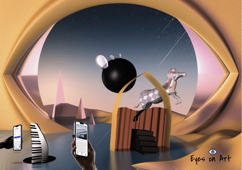
Eyes on Art bridges the gap between curiosity and knowledge by transforming any painting into an interactive learning experience. It is a visual recognition app that makes art both accessible and engaging: by scanning a painting, users can instantly discover its title, artist, medium, story, and museum location—turning every artwork into a moment of learning and connection.
Conceptual Inspiration
Seeing as Interaction
The conceptual foundation of Eyes on Art draws inspiration from the phenomenology of perception, particularly the philosophy of Maurice Merleau-Ponty. In his work, vision is not simply the act of observing objects; rather, it emerges through a dynamic relationship between the viewer and the visible world.
Merleau-Ponty described this relationship as an intertwining of vision, where the viewer and the artwork exist in a reciprocal encounter. Seeing is therefore not a one-directional act. When we look at an artwork, we are not only observing it — the artwork also “addresses” the viewer, creating a dialogue between perception and meaning.
This perspective offers a valuable lens for designing an art discovery experience. Rather than treating artworks as static objects to be identified, Eyes on Art encourages users to actively engage with visual works through scanning, exploration, and contextual learning.
By allowing users to identify artworks, access historical and cultural information, and discover related pieces, the interface supports a deeper interaction with visual culture. In this way, the app transforms the act of viewing from passive recognition into an active process of interpretation and discovery.
Problem Analysis
Despite the increasing availability of digital art platforms, many users still feel disconnected from art. The issue is not access — it is experience design.
1. Art Feels Intimidating and Exclusive
For many users without formal art education, traditional art spaces — whether museums or academic platforms — can feel intimidating. Descriptions are often written in complex, academic language, assuming prior knowledge of art history, movements, and terminology.
As a result, users may feel:
Unsure whether they are “understanding” the artwork correctly
Hesitant to explore further
Disconnected from the emotional experience of viewing art
This creates a psychological barrier that discourages engagement.
2. Information Overload in Digital Art Platforms
Many existing art apps present large amounts of text alongside the artwork. While comprehensive, this structure often overwhelms users.
Common issues include:
Dense paragraphs competing visually with the artwork
No clear hierarchy between essential and supplementary information
Excessive scrolling
Lack of visual breathing space
Instead of supporting discovery, the interface distracts from the artwork itself.
3. Passive Viewing Experience
Traditional digital galleries often replicate museum labels: static image + static description.
This model results in passive consumption rather than interaction. Users scroll, read briefly, and move on — without forming a deeper connection.
There is little opportunity for:
Personal reflection
Custom curation
Exploration based on interest
Building a long-term relationship with art
4. Lack of Personalization
Art appreciation is highly subjective. However, many platforms present artworks in generic categories without adapting to individual interests.
Users may struggle to:
Discover artworks aligned with their taste
Explore themes across time periods
Follow artists or movements they care about
Without personalization, engagement remains shallow.
5. Poor Balance Between Aesthetics and Usability
Art apps often fall into one of two extremes:
Overly artistic interfaces that sacrifice clarity
Highly functional layouts that feel cold and uninspiring
Designing for art requires a delicate balance — the interface must be visually refined yet invisible enough to let the artwork remain the focus.
Core Design Question
How might we design a digital art experience that:
Reduces intimidation
Prevents information overload
Encourages active exploration
Feels elegant yet intuitive
Supports emotional connection rather than academic pressure
Eyes on Art was developed as a response to these challenges.
Design Framing
Design Solutions
In response to the identified challenges, Eyes on Art was designed as a human-centered, layered, and emotionally engaging digital experience. Every design decision was guided by the goal of making art feel accessible without diminishing its depth.
1. Reducing Intimidation Through Accessible Language
To address the psychological barrier many users experience, the app replaces academic-heavy descriptions with clear, conversational microcopy.
Strategy:
Use concise summaries as the first layer of information
Avoid unnecessary art jargon
Provide optional deeper explanations for users who want to explore further
This layered content structure allows beginners to feel comfortable while still supporting advanced users. By giving users control over how much information they consume, the experience becomes inclusive rather than exclusive.
2. Preventing Information Overload with Layered Content Design
Instead of presenting long blocks of text alongside artworks, information is progressively disclosed.
Solution Approach:
Essential details (artist, year, medium) appear first
Contextual explanations are collapsible
Extended analysis is hidden behind expandable sections
This reduces visual clutter and ensures the artwork remains the primary focal point. White space is intentionally used to create breathing room, allowing users to focus without cognitive fatigue.
3. Transforming Passive Viewing into Active Engagement
To move beyond static image-and-label formats, the app introduces interactive features that encourage participation.
Interaction Strategies:
Save and curate personal collections
Discover related artworks through thematic suggestions
Explore artist timelines or movement-based navigation
By enabling users to build their own curated spaces, the experience shifts from passive scrolling to personal discovery. Engagement becomes ongoing rather than one-time.
4. Introducing Personalization to Deepen Connection
Recognizing that art appreciation is subjective, the platform integrates personalized exploration paths.
Implementation:
Interest-based recommendations
Thematic browsing (emotion, color, style, era)
“You may also like” suggestions
This allows users to follow curiosity rather than rigid art historical structures. The app becomes a companion that adapts to individual taste, strengthening long-term engagement.
5. Balancing Aesthetics with Usability
Designing for art requires restraint. The interface must feel refined without competing visually with the artworks.
Design Principles Applied:
Neutral color palette to avoid visual conflict
Consistent framing system for artworks
Clear typographic hierarchy
Minimal navigation layers
The interface was intentionally designed to “step back” — supporting the content without overshadowing it. This balance ensures usability remains high while preserving a premium visual identity.
6. Creating Emotional Space for Reflection
Beyond functionality, the app emphasizes mindful viewing. The use of generous spacing, calm color tones, and subtle transitions encourages users to slow down.
Rather than pushing rapid content consumption, the design promotes intentional exploration — aligning the digital experience more closely with the contemplative nature of art.
Outcome
Through layered information architecture, intuitive interaction design, and a restrained visual language, Eyes on Art transforms art exploration into a welcoming and personalized journey.
The solution is not simply a digital gallery — it is a thoughtfully crafted space where users can observe, reflect, and build meaningful connections with art.

Target Users & User Needs
Eyes on Art is designed for a diverse audience united by curiosity about art, yet differentiated by context, motivation, and depth of engagement.
1. Students & Educators
Goal: Access quick, reliable, and structured art insights for learning and teaching.
Students often need clear explanations without overly academic language, while educators require trustworthy summaries that support classroom discussion. Both groups value accuracy, clarity, and efficient information retrieval.
The app supports them by:
Providing concise, structured artwork details
Offering layered explanations for different knowledge levels
Enabling quick recognition and contextual understanding
This ensures art learning becomes accessible rather than overwhelming.
2. Museum Visitors & Cultural Tourists
Goal: Enhance real-time, self-guided exploration experiences.
Visitors frequently encounter artworks without sufficient context or time to read lengthy descriptions. They need immediate information that complements, rather than distracts from, the physical experience.
Eyes on Art supports this scenario by:
Enabling instant artwork recognition
Delivering digestible summaries in seconds
Connecting digital discovery with physical museum locations
The app acts as a personal cultural companion, available anytime and anywhere.
3. Art Enthusiasts & Collectors
Goal: Deepen knowledge and build meaningful connections with art and artists.
This group seeks more than surface-level information. They value historical context, artistic techniques, and thematic relationships between works.
The platform provides:
Structured technical details
Contextual storytelling
The ability to curate personal collections
By enabling saving and comparison, the app transforms appreciation into an ongoing, evolving journey.
4. Curious Minds
Goal: Integrate art discovery into everyday life.
Not all users approach art academically. Many encounter artworks casually — online, in public spaces, or through social media — and want quick answers that satisfy curiosity.
The app reduces friction by:
Providing immediate recognition
Offering clear and approachable explanations
Encouraging spontaneous exploration
This makes art feel approachable rather than exclusive.
User Insight Summary
Across all user groups, three core needs emerged:
Immediate clarity
Reduced intimidation
Meaningful engagement
Eyes on Art is designed to respond to these shared needs while supporting different levels of depth and expertise.
To address the core challenges of intimidation, information overload, and passive engagement, the design strategy for Eyes on Art was built around clarity, emotional accessibility, and structured exploration.
Rather than simply digitizing a gallery experience, the goal was to rethink how users interact with art in a mobile context — where attention spans are shorter, curiosity is spontaneous, and cognitive load must be carefully managed.
The strategy was guided by four key principles:
1. Accessibility Before Expertise
Art platforms often assume prior knowledge. This project intentionally reverses that assumption.
The interface and content structure were designed to:
Lower psychological barriers
Replace academic-heavy descriptions with clear, approachable language
Provide multiple layers of depth for different knowledge levels
By prioritizing accessibility, the app invites engagement from beginners without alienating experienced users.
2. Layered Information Architecture
To prevent cognitive overload, information is structured progressively rather than presented all at once.
This approach ensures:
Essential facts appear immediately
Deeper insights are optional and expandable
Visual space supports focused attention
Layering content allows users to control the pace and depth of their exploration, aligning with natural curiosity-driven behavior.
3. Artwork-Centered Experience
The design intentionally steps back to let the artwork remain dominant.
Strategic decisions include:
Neutral color environments
Minimal interface distractions
Clear framing systems
Balanced typography hierarchy
The interface functions as a quiet guide rather than a competing visual element.
4. Active Engagement Over Passive Viewing
Traditional digital galleries replicate static museum labels. Eyes on Art shifts toward participation.
The strategy introduces:
Instant recognition to capture spontaneous curiosity
Save & collect features to promote ownership
Thematic discovery to encourage exploration
By turning browsing into interaction, the app fosters deeper, longer-term engagement.
5. Calm, Focused Digital Experience
In contrast to fast-scrolling content platforms, Eyes on Art promotes intentional engagement.
Generous white space, restrained transitions, and a clear visual rhythm create a sense of calm. This aligns the digital experience more closely with the contemplative nature of art appreciation.
Design Strategy
User Flow
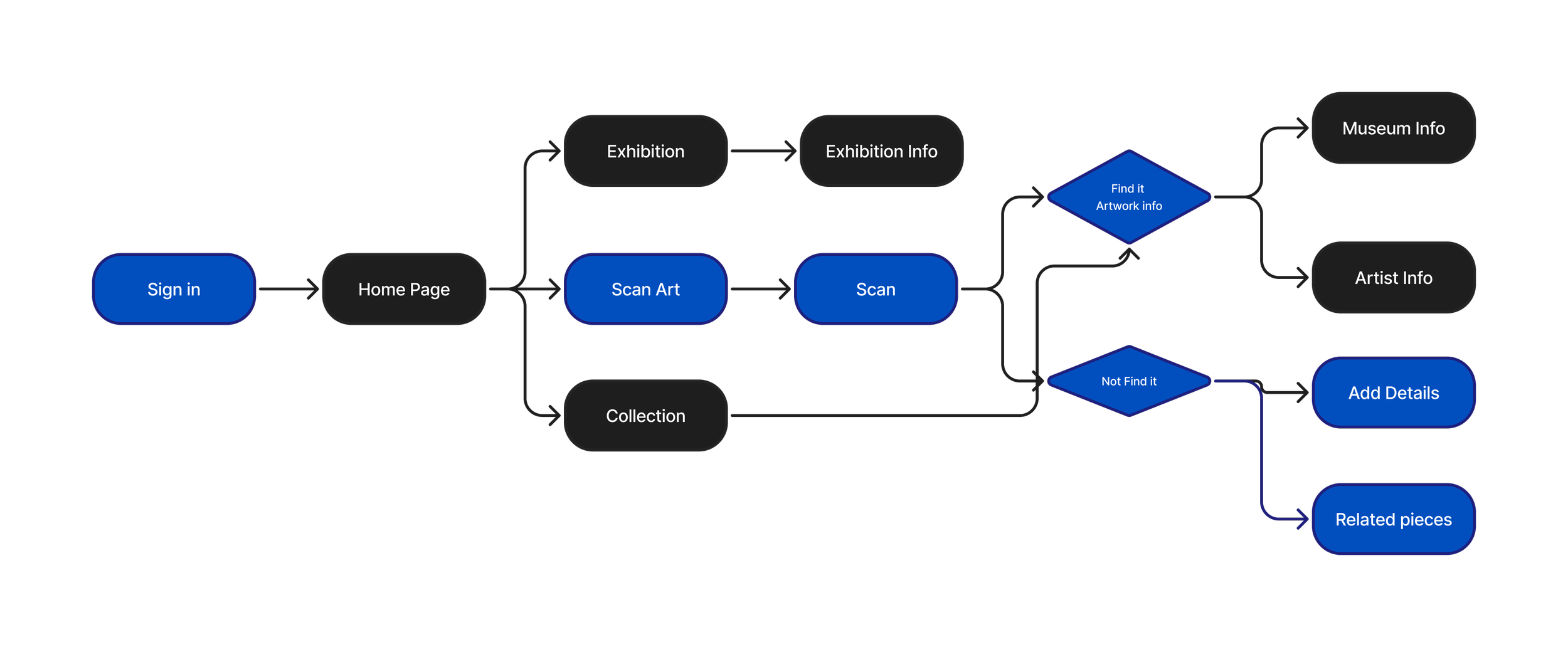
The user flow of Eyes on Art is structured around three primary interaction modules: Exhibition, Scan Art, and Collection.
Each module supports a different user intention — exploration, instant recognition, and personal curation — while maintaining a consistent and intuitive navigation system.
The architecture was designed to ensure that users can move seamlessly between discovery and ownership without cognitive overload.
1. Exhibition Flow
Purpose: Guided exploration and thematic discovery
Flow:
Home → Exhibition → Artwork Grid → Artwork Detail → Related Works → Save to Collection
The Exhibition section functions as a curated digital gallery. Users can browse artworks organized by themes, periods, or movements.
Design Intent:
Provide structured discovery without overwhelming the user
Present artworks in a visually balanced grid
Keep artwork thumbnails clean and distraction-free
Allow immediate access to essential information
From each artwork detail page, users can explore related works or save pieces to their personal collection, encouraging deeper engagement.
2. Scan Art Flow
Purpose: Real-time curiosity capture
Flow:
Home → Scan Art → Camera Recognition → Artwork Result → Structured Overview → Save / Explore Further
The Scan Art feature addresses spontaneous real-world encounters. Whether in a museum, book, or online, users can instantly identify a painting.
Design Intent:
Reduce friction in information searching
Deliver essential details immediately
Provide layered content for optional deeper exploration
Bridge offline encounters with digital learning
This flow supports immediate clarity while encouraging continued interaction through saving or browsing related works.
3. Collection Flow
Purpose: Personal curation and long-term engagement
Flow:
Home → Collection → Saved Artworks → Artwork Detail → Organize / Revisit
The Collection module transforms passive browsing into active ownership. Users can revisit saved artworks, reflect, and build personal galleries.
Design Intent:
Encourage emotional attachment
Promote long-term retention
Support personal organization of art interests
The Collection becomes a dynamic space where users track their evolving taste and deepen their knowledge over time.
Flow Integration Strategy
Although structured into three modules, the system avoids isolation between them.
Artworks discovered in Exhibition can be saved to Collection.
Recognized artworks from Scan flow directly into detail pages.
Collection items link back to related works for continued discovery.
This interconnected design creates a continuous engagement loop rather than isolated linear paths.
Outcome
By organizing the experience into Exhibition, Scan, and Collection, the app supports three distinct behaviors:
Guided exploration
Instant recognition
Personal curation
The flow balances structure with flexibility, ensuring the experience remains intuitive while encouraging deeper interaction with art.
1. Instant Art Recognition
Users can scan any painting to instantly identify the artwork’s title, artist, and creation date within seconds.
This feature addresses the common real-world scenario where users encounter art in museums, books, or online but lack contextual information. Instead of manually searching or feeling uncertain, the recognition tool provides immediate clarity, reducing friction and encouraging spontaneous exploration.
By combining speed with accuracy, the experience supports curiosity in the exact moment it occurs.
2. Structured Artwork Details
Each artwork includes clearly organized information such as medium, dimensions, and artistic techniques.
Rather than presenting dense paragraphs, content is structured hierarchically to reduce cognitive overload. Essential facts are displayed first, while deeper technical insights remain accessible through expandable sections.
This layered architecture allows both beginners and advanced users to engage comfortably at their preferred depth.
3. Story Behind the Painting
Beyond factual data, the app provides accessible narratives that explain the historical background, cultural context, and symbolic meaning of each piece.
This feature shifts the experience from informational to emotional. By contextualizing artworks within their time and social environment, users form stronger personal connections rather than passively consuming isolated facts.
The tone is intentionally conversational to reduce intimidation while maintaining intellectual depth.
4. Museum & Gallery Integration
Users can view where the artwork is currently displayed and access practical visiting information.
This bridges the gap between digital discovery and physical experience. The feature transforms the app from a standalone gallery into a cultural companion, supporting real-world engagement and encouraging museum visits.
5. Save & Personal Collection
Users can bookmark artworks and curate their own collections.
This transforms passive browsing into active participation. By enabling users to build personal galleries, the app fosters ownership, reflection, and long-term engagement.
Curation encourages users to revisit, compare, and deepen their appreciation over time.
Key Features
Color Strategy
The visual identity of Eyes on Art is built around a balanced, contemporary color system that supports clarity, emotional accessibility, and structured exploration. The palette was intentionally designed to reinforce the app’s dual role as both a discovery tool and an educational companion.
The foundation of the interface relies on clean, restrained neutrals. These tones create visual breathing space and prevent competition with the artwork itself. By reducing background visual noise, the interface allows paintings to remain the primary focal point while maintaining high readability and accessibility standards.
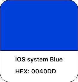
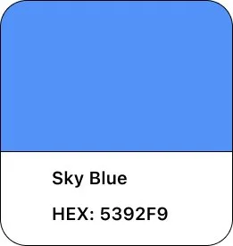
Deep blue tones serve as the structural anchor of the system. Blue conveys trust, stability, and intellectual depth — qualities aligned with the app’s educational purpose. It establishes a sense of professionalism and credibility without feeling institutional or rigid.
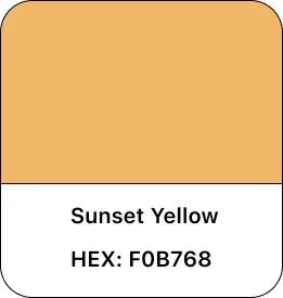
Warm yellow accents are introduced selectively to signal interaction points and active states. The contrast between blue and yellow creates visual energy while maintaining balance. Yellow functions as a guidance tool — drawing attention to key actions such as scanning, saving, or navigating — without overwhelming the overall calm atmosphere.
The interaction between cool and warm tones creates a visual rhythm that mirrors the app’s strategic goals: structured yet approachable, informative yet inviting. This controlled contrast ensures intuitive navigation while preserving a refined, artwork-centered experience.
Overall, the color system supports usability, hierarchy, and emotional tone — reinforcing the app’s mission to make art exploration accessible, engaging, and visually harmonious.
Typography System
Typography in Eyes on Art was designed to balance clarity, platform consistency, and cultural refinement. Because the application functions as both a discovery tool and an educational companion, the type system needed to feel structured and trustworthy while remaining approachable.
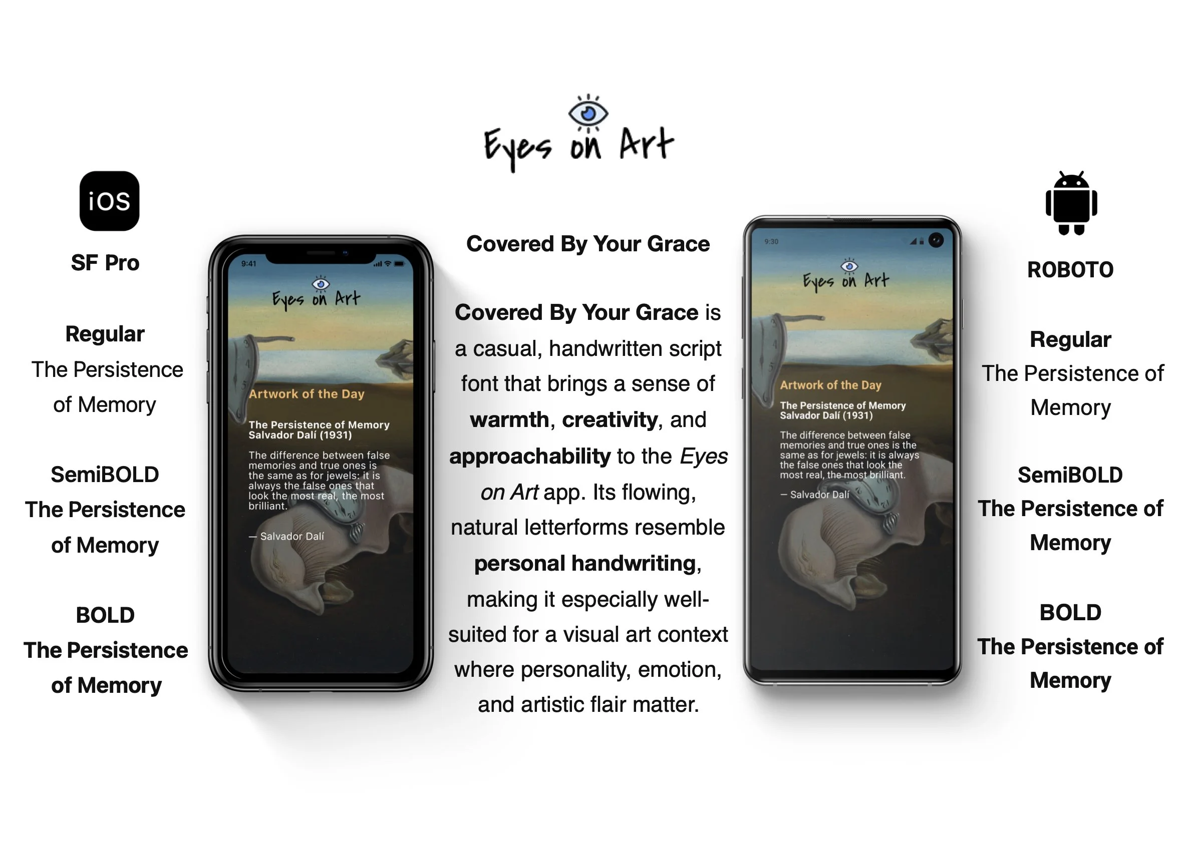
1.Platform-Based Typeface Selection
To ensure optimal performance and native familiarity, the app adopts system-default typefaces:
iOS: SF Pro
Android: Roboto
Using SF Pro on iOS maintains alignment with Apple’s Human Interface Guidelines. Its geometric precision and clean proportions enhance legibility across varying screen sizes while preserving a contemporary aesthetic.
On Android, Roboto ensures visual consistency within the Material Design ecosystem. Its open letterforms and balanced spacing support readability, particularly in longer explanatory texts.
This platform-aware approach strengthens usability by leveraging users’ existing familiarity with their operating system’s typography standards, reducing cognitive friction.
2.Hierarchy & Information Structure
Given the layered content strategy of the app, typography plays a central role in guiding attention and preventing information overload.
The hierarchy is structured as follows:
H1 – Artwork Title / Primary Headers
Larger scale with increased weight to immediately anchor the page. Establishes clear visual entry points.
H2 – Section Headers (Artist, Context, Technique)
Slightly reduced size with strong contrast from body text to define structured content blocks.
Body Text – Descriptions & Narratives
Optimized for readability with comfortable line spacing and moderate line length to support extended reading without fatigue.
Secondary Metadata – Year, Medium, Dimensions
Reduced size and lighter weight to differentiate supporting details from primary content.
This hierarchy ensures that users can quickly scan essential information while seamlessly transitioning into deeper reading if desired.
3.Typography as a Cognitive Tool
The typography system directly supports the app’s goal of reducing intimidation and cognitive load.
Key considerations include:
Controlled line length to improve comprehension
Adequate spacing to prevent visual density
Clear contrast ratios for accessibility compliance
Minimal decorative styling to avoid distraction from artwork
Rather than competing visually with the paintings, typography acts as a quiet structural guide. It organizes information in a calm, predictable manner, reinforcing the layered information architecture introduced in the design strategy.
Outcome
By combining native platform typefaces with a carefully structured hierarchy, the typography system enhances clarity, accessibility, and visual harmony. It supports both quick scanning and in-depth learning, aligning with the app’s mission to make art exploration intuitive and approachable.
Layout & Grid System
The layout system of Eyes on Art was designed to support clarity, reduce cognitive load, and maintain visual balance across both iOS and Android platforms. Given that artwork is the primary content, the grid structure needed to remain restrained, consistent, and content-first.
The layout strategy focuses on three core principles: controlled spacing, intentional white space, and clear content hierarchy.
1.Spacing Decisions
Spacing is treated as a structural tool rather than a decorative element. A consistent spacing scale is applied throughout the interface to create rhythm and predictability.
Key considerations include:
Consistent vertical spacing between content blocks
Defined padding around artwork images
Clear separation between metadata and descriptive text
Comfortable margins to prevent visual crowding
This structured spacing system improves scannability and allows users to quickly differentiate between essential information and supporting details.
On iOS, spacing aligns with Apple’s Human Interface Guidelines, maintaining balanced margins and centered content alignment. On Android, spacing respects Material Design standards, slightly emphasizing structural clarity and content grouping.
Although both platforms follow the same design system, micro-adjustments ensure the layout feels native rather than forced.

2.Use of White Space
White space plays a central role in the overall experience. Rather than filling the screen with information, the design intentionally creates breathing room around each artwork.
The purpose of white space in this app is threefold:
To reduce cognitive overload
To maintain focus on the artwork
To encourage slower, more intentional engagement
By allowing visual pauses between elements, the interface mirrors the contemplative nature of gallery viewing. The absence of clutter reinforces the app’s calm and educational tone.
3.Content Hierarchy
The grid structure supports a clear content hierarchy that aligns with the layered information strategy.
At the top level:
Artwork images occupy dominant visual weight
Titles and primary metadata follow immediately
Secondary information:
Contextual explanations
Technical details
Expandable sections
This hierarchy ensures that users encounter information progressively rather than simultaneously.
In exhibition views, a modular grid presents artworks in balanced columns, optimized for thumb reach and scanning behavior. On iOS, this grid leans toward symmetrical alignment and visual harmony. On Android, the structure reflects Material Design’s emphasis on structured grouping and clear elevation distinctions.
Despite platform nuances, the system remains unified through consistent proportions and predictable interaction zones.

iOS Prototype

Cross-Platform Adaptation & UX Differences
Visual Consistency Across Platforms
Although Eyes on Art was designed for both iOS and Android environments, maintaining brand cohesion across platforms was a key priority. Both systems share a unified visual language built around a clean, artwork-focused layout and a controlled color palette consisting of sky blue, vivid blue, and sunset yellow.
The core visual principles — generous white space, artwork-first composition, and structured content hierarchy — remain consistent across devices. This ensures users experience the same emotional tone and brand identity regardless of platform.
Typography, spacing systems, and UI components are adapted subtly to respect native interaction behaviors. Navigation styles, back gestures, and system conventions are implemented according to platform guidelines, preserving familiarity and reducing cognitive friction.
The result is a balanced approach: visually cohesive, yet behaviorally native.
Differences in UX Between iOS and Android
While the visual system remains consistent, practical differences emerged in interaction patterns and spatial behavior between platforms.
1.Navigation Structure
The iOS prototype uses a tab bar navigation model aligned with Apple’s Human Interface Guidelines. Swipe gestures and native blue accent interactions reinforce familiarity for iOS users.
On Android, navigation aligns with Material Design principles, emphasizing clearer structural grouping and vertical progression.
2.Spacing & White Space
During testing, the Android prototype exhibited slightly more vertical spacing and padding. While this enhanced visual breathing room, it also introduced additional white space that occasionally reduced information density. This insight was documented for refinement to achieve better balance.
3.Typography & Readability
Font rendering differences resulted in slightly smaller perceived text size on Android devices. This impacted readability in longer descriptions and was identified as an area for adjustment in future iterations.
Outcome
The Layout & Grid System creates a structured yet breathable interface where users can focus on art without distraction. By combining consistent spacing, intentional white space, and a clear hierarchy, the system supports both quick scanning and deep reading — reinforcing the app’s mission to make art exploration intuitive, calm, and accessible.
Imagery & Framing System
Because artwork is the core content of Eyes on Art, the imagery system was designed to prioritize visual integrity, focus, and consistency. The interface does not compete with the artwork — it frames and supports it.
The imagery and framing decisions were guided by three core principles: artwork dominance, structural consistency, and visual balance.
1.Artwork-First Composition
Every screen is designed around the principle that the artwork must remain the visual focal point.
To achieve this:
Artwork images occupy the largest visual weight on detail pages
Background colors are neutral and low-contrast
Decorative UI elements are minimized
Text never overlays critical visual areas of the painting
This ensures that the digital experience mirrors the focus and respect of a physical gallery setting.
The interface steps back, allowing the artwork to command attention.
2.Consistent Framing System
A structured framing approach is applied across exhibition views, search results, and collections.
Key decisions include:
Uniform corner radius for artwork thumbnails
Consistent image aspect ratio handling
Equal padding around all artwork containers
Balanced shadow or elevation usage (platform-adapted)
This consistency creates visual rhythm and predictability, reducing cognitive effort when scanning multiple artworks.
Rather than visually overwhelming users with irregular shapes or inconsistent cropping, the system maintains harmony across grids and detail pages.
3.Aspect Ratio & Cropping Strategy
Artworks come in varying dimensions — portrait, landscape, square — which presents layout challenges.
To preserve artistic integrity:
Images are never aggressively cropped
Aspect ratios are maintained whenever possible
Grid previews use intelligent scaling to avoid distortion
Full-screen views allow immersive, uninterrupted display
This approach respects the original composition of each artwork while maintaining structural alignment within the interface.
4.Visual Balance with Surrounding UI
The relationship between artwork and interface elements was carefully calibrated.
Design considerations include:
Adequate padding between images and text
Clear separation between metadata and visual content
Subtle elevation effects (Android) or depth layering (iOS)
Avoidance of heavy borders that could distract from the image
The goal was to create a quiet framing system — one that enhances clarity without visually “boxing in” the artwork.
5.Emotional & Experiential Impact
Imagery is not treated as decorative content, but as the emotional center of the experience.
By combining consistent framing, controlled spacing, and restrained UI elements, the system:
Encourages focused observation
Reduces distraction
Supports mindful engagement
Reinforces the app’s educational and contemplative tone
The result is a digital environment that feels gallery-like, calm, and respectful of artistic detail.
Outcome
The Imagery & Framing system ensures that artworks remain visually dominant while the interface provides structural support. Through consistency, balance, and thoughtful scaling, the design maintains aesthetic harmony across both iOS and Android platforms.
This reinforces the app’s mission: to make art accessible without diminishing its visual impact.
Design Impact
The Eyes on Art project demonstrates how thoughtful UX structure and restrained visual design can transform digital art exploration into a more accessible and engaging experience.
By addressing intimidation, cognitive overload, and passive browsing behaviors, the final design achieves three key outcomes:
1. Reduced Cognitive Friction
Through layered information architecture, structured spacing, and clear typographic hierarchy, the app minimizes visual density and decision fatigue. Essential information is surfaced immediately, while deeper context remains optional.
This allows users to engage with art at their own pace, improving clarity without oversimplifying content.
2. Increased Engagement Through Interaction
The integration of three core modules — Exhibition, Scan Art, and Collection — shifts the experience from passive consumption to active participation.
Users can:
Discover art through curated exploration
Instantly identify artworks in real-world contexts
Build personal collections over time
This interconnected system creates a continuous engagement loop rather than isolated interactions.
3. Strengthened Emotional Accessibility
By combining approachable language, calm visual design, and artwork-first composition, the app reduces psychological barriers often associated with art platforms.
The restrained color palette, structured layout, and consistent framing reinforce a gallery-like experience that feels intentional, inclusive, and respectful of artistic content.
4. Cross-Platform Adaptability
The project also demonstrates adaptive design thinking across iOS and Android ecosystems. While maintaining a cohesive visual identity, layout spacing, typography rendering, and navigation behaviors were refined to align with platform-native standards.
This balance between brand consistency and native usability strengthens overall user trust and familiarity.
Overall Impact
Eyes on Art repositions digital art engagement from an information-heavy archive to a guided, structured, and emotionally accessible exploration tool.
The project highlights how UX strategy — not just interface aesthetics — can reshape how users interact with cultural content in digital environments.
1.Design Challenge & Key Learning
The most significant challenge in this project was balancing aesthetic expression with functional clarity. Artworks are inherently visually powerful, and there was a constant tension between preserving their impact and maintaining a structured, accessible interface.
Designing for art requires restraint. Rather than adding visual embellishment, the challenge became knowing what to remove. Through iterative refinement, I learned that clarity often strengthens aesthetic impact. By simplifying navigation, controlling spacing, and applying a consistent framing system, the interface enhances — rather than competes with — the artwork.
This process reinforced an important principle: strong UX design is often invisible. The most effective solution was not to decorate the experience, but to create a calm structure that supports focused engagement.
2.Evolution from Concept to Execution
The final design closely reflects the original vision of creating an intuitive, discovery-driven art experience. However, the journey from early sketches to the final prototype significantly strengthened the structural foundation of the app.
Initial concepts emphasized exploration and playfulness, but lacked hierarchy and interaction clarity. Through refinement, the system evolved into a more robust architecture with:
Clear modular flows (Exhibition, Scan Art, Collection)
Layered information hierarchy
Improved cross-platform consistency
Stronger cognitive load management
The outcome preserves curiosity and discovery while offering greater usability and structural coherence.
3.Areas for Future Development
While the current solution establishes a solid foundation, several opportunities remain for enhancement.
(1) Gamification & Motivational Design
Introducing achievement systems such as badges, learning milestones, or thematic challenges could further encourage ongoing engagement. Thoughtfully designed gamification elements would need to remain subtle to avoid undermining the app’s calm, gallery-like atmosphere.
(2) Advanced Personalisation
Future iterations could integrate adaptive recommendation systems that respond to user behavior, saved collections, and exploration patterns. Personalised pathways would deepen emotional connection and support long-term retention.
(3) Expanded User Testing & Accessibility Refinement
Additional usability testing across diverse user groups — including beginners, educators, and experienced art enthusiasts — would provide valuable insights into reading comfort, navigation efficiency, and accessibility compliance. Particular attention would be given to typography scaling, contrast ratios, and cross-platform rendering differences identified during early evaluation.
Professional Growth
This project strengthened my ability to design systems rather than isolated screens. It required aligning strategy, structure, and visual language into a cohesive experience.
More importantly, it reinforced the value of designing with intentional restraint — allowing content to lead while interface decisions quietly support usability and engagement.
Reflection & Future Directions
Future Improvements
While Eyes on Art establishes a strong foundation for accessible and structured art exploration, several opportunities exist to further enhance engagement, personalization, and long-term product value.
1. Intelligent Personalization System
Future iterations would integrate adaptive recommendation logic based on user behavior, saved collections, and browsing patterns.
Rather than offering static thematic categories, the system could:
Suggest artworks aligned with a user’s visual preferences
Recommend artists based on saved pieces
Create personalized exploration paths
This would transform the experience from curated discovery to adaptive learning, increasing long-term engagement and emotional connection.
2. Enhanced Learning Motivation Through Subtle Gamification
To strengthen user retention without compromising the app’s calm aesthetic, carefully designed gamification elements could be introduced.
Potential features include:
Milestone badges for completed exhibitions
Exploration challenges (e.g., “Discover 5 Impressionist works”)
Progress indicators for thematic journeys
The design challenge would be integrating motivation systems in a refined, non-distracting manner that complements the educational tone.
3. Accessibility & Inclusivity Optimization
While the current system emphasizes clarity and structured hierarchy, further refinement could enhance inclusivity.
Future improvements would include:
Expanded dynamic type scaling
Enhanced contrast testing across devices
Voice guidance for visually impaired users
Simplified reading modes for beginners
Conducting broader usability testing across age groups and cultural backgrounds would ensure the experience remains accessible to diverse audiences.
4. Deeper Cross-Platform Refinement
Testing revealed subtle differences in spacing density and typography rendering between iOS and Android. Future iterations would focus on:
Fine-tuning vertical spacing on Android
Adjusting font scaling for improved readability
Optimizing gesture behavior consistency
These refinements would strengthen platform-native familiarity while preserving brand cohesion.
5. Immersive & Contextual Expansion
Looking ahead, the app could evolve beyond static exploration by incorporating:
Augmented Reality (AR) museum companion features
Real-time exhibition integration
Community-curated collections
Artist spotlight narratives
These enhancements would deepen contextual engagement and expand the app’s role from discovery tool to interactive cultural platform.
Long-Term Vision
The long-term ambition for Eyes on Art is to become a structured yet emotionally accessible ecosystem for art engagement — one that supports curiosity at every level, from casual discovery to advanced learning.
Future iterations will continue to refine the balance between aesthetic integrity, usability, and intelligent interaction design.
Sign in
Sign in to explore curated collections, follow your favorite artists, and experience the world through their eyes.
Artwork of the Day
Discover a new masterpiece each day—handpicked to inspire, provoke, and celebrate artistic vision around the world.
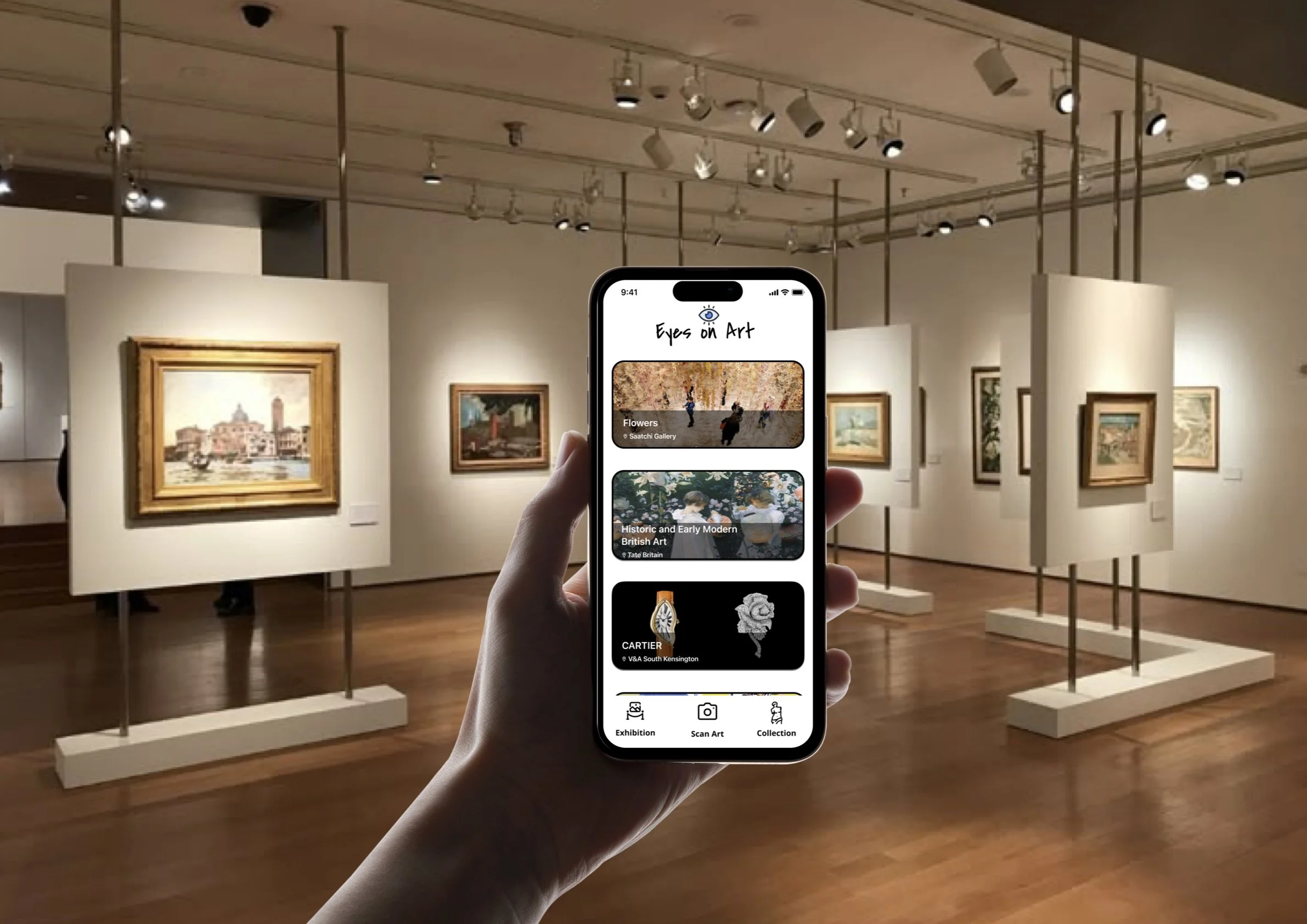
Exhibition
Step into immersive exhibitions showcasing curated works from emerging and established artists around the world.
Exhibition Info
Explore in-depth exhibition details, featured artworks, artist insights, and the stories behind each curated collection.
Camera
Scan the artwork in front of you—our AI will identify it and instantly show matching results from the global art archive.
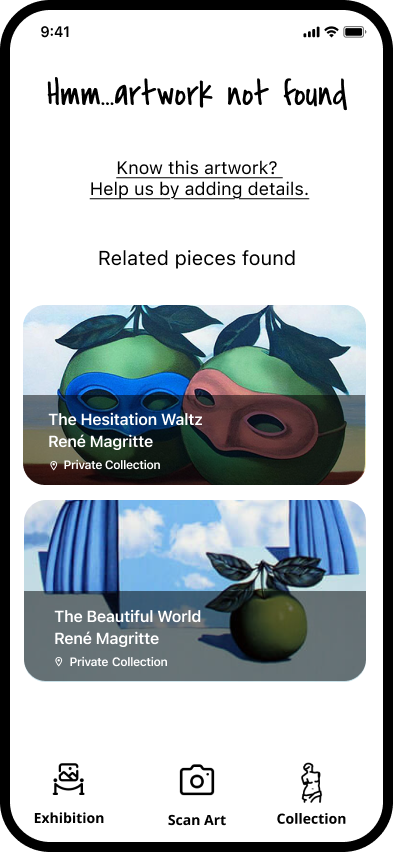
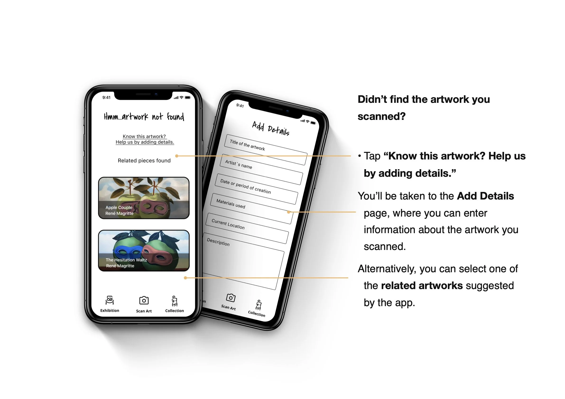
Scan Result - Didn´t Find It
We couldn’t identify the artwork—help us improve by adding details or trying a clearer image.
Scan Result - Find It
View matching artworks, artist details, and exhibition history based on your scan—discover where the piece lives in the art world.
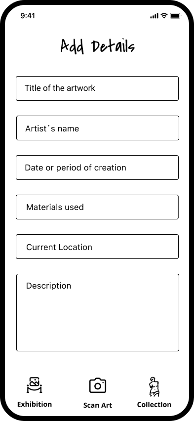
Add Details
Share what you know—add the artist’s name, title, or any details to help us enrich the global art archive.
Artist Info
Learn about the artist’s journey, explore their body of work, and connect with the vision behind each creation.
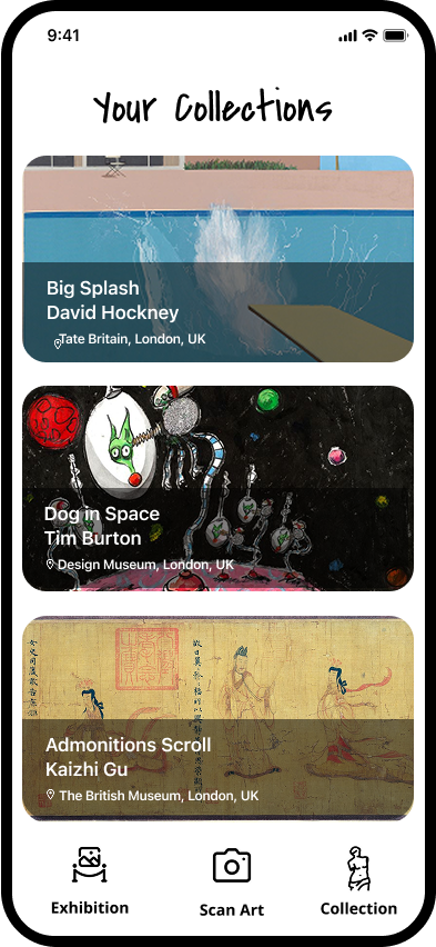
Your Collections
Browse and organise your saved artworks, exhibitions, and discoveries—all in one personalized collection.
Museum Info
Explore detailed information about museums, including current exhibitions, featured collections, location, and visiting hours—all in one place.