
Let Your Taste Lead The Way.
“The general principles of taste are uniform in human nature.”
— David Hume
Wine’d Journey is a refined tasting companion that lets users explore, document, and reflect on their wine experiences through elegant journaling, personalised notes, and curated discovery tools.
Context & Design Objective
The wine industry is rich in heritage, terminology, and regional complexity. However, this depth often becomes a barrier rather than a benefit for everyday consumers. Wine labels, tasting notes, and digital platforms frequently prioritise technical classifications — grape varieties, appellations, fermentation methods — over user-oriented guidance.
For casual consumers, this creates three recurring challenges:
Decision anxiety when selecting a bottle
Cognitive overload from excessive technical information
Lack of confidence in understanding personal taste preferences
Many existing wine apps function primarily as databases. While comprehensive, they assume prior knowledge and require users to navigate industry language before reaching meaningful insight. As a result, exploration becomes effortful rather than enjoyable.
Wine’d Journey was conceived as a response to this disconnect.
Rather than asking users to adapt to the complexity of wine, the app adapts the presentation of wine to the user.
Conceptual Inspiration
Taste, Judgment, and the Experience of Wine
The conceptual foundation of Wine’d Journey draws inspiration from the aesthetic philosophy of David Hume, particularly his reflections on taste and judgment in Of the Standard of Taste (1757).
Hume argued that judgments of taste are shaped not only by individual preference but also by experience, comparison, and cultivated perception. True appreciation develops gradually as individuals learn to recognize subtle differences in flavor, balance, and character.
Wine culture reflects a similar process. While wine appreciation often appears technical or exclusive, it ultimately relies on developing one’s own sensory experience and taste awareness.
Wine’d Journey translates this philosophical idea into interface design by shifting the focus from technical terminology toward guided sensory exploration. Instead of overwhelming users with complex classifications, the app encourages discovery through flavor profiles, curated selections, and intuitive navigation.
In this way, the product design mirrors Hume’s insight that taste evolves through experience, reflection, and comparison, allowing users to gradually develop confidence in their own preferences.
Problem Analysis
Despite wine being one of the most culturally rich and socially shared products, the decision-making experience often feels intimidating and cognitively demanding. Through user observation and competitive analysis, four core friction points emerged.
1. Wine Feels Overly Technical
The wine industry relies heavily on specialised terminology — grape varieties, appellations, fermentation methods, tannin structure, acidity levels. While meaningful to experts, this language can alienate casual consumers.
Users often experience:
Uncertainty about what terms actually mean
Fear of making the “wrong” choice
Dependence on external recommendations
Instead of empowering decision-making, complexity creates hesitation. The gap between industry language and everyday taste perception becomes a psychological barrier.
2. Information Overload
Wine labels and digital listings frequently present dense blocks of information simultaneously: vintage year, alcohol percentage, region, producer history, tasting notes, awards.
When all information is presented at once:
Users struggle to identify what matters most
Scanning becomes effortful
Cognitive fatigue reduces engagement
Rather than guiding the user through a structured decision process, the interface demands prior knowledge to interpret the data.
3. Lack of Personal Guidance
Most wine apps function as searchable databases rather than intelligent guides. They categorise wines by technical attributes but rarely adapt to how users actually choose wine — by flavour preference, mood, or occasion.
As a result:
Users must translate personal taste into technical filters
Discovery feels mechanical rather than intuitive
There is minimal sense of progression or learning
Without personalised pathways, exploration lacks direction.
4. Passive Browsing & Low Retention
Traditional wine lists encourage scrolling behaviour without interaction. Users browse, compare prices, and exit — with little incentive to return.
There is often:
No structured collection system
No memory of past preferences
No reinforcement of taste development
Without mechanisms for ownership or reflection, engagement remains transactional rather than experiential.
Core Insight
The central issue is not access to wine information — it is how that information is structured and translated for human decision-making.
Wine selection should feel intuitive and exploratory. Instead, many current experiences prioritise completeness over clarity.
Wine’d Journey addresses this disconnect by redesigning wine discovery around taste, structure, and guided exploration.
Target Users & User Needs
Wine’d Journey is designed for a broad audience united by curiosity about wine, yet differentiated by experience level, motivation, and context of use. The goal is not to segment users by expertise alone, but by how they approach decision-making.
1. Beginners
Profile:
Individuals new to wine who feel overwhelmed by labels, terminology, and variety.
Pain Points:
Difficulty understanding grape names or regions
Anxiety about choosing incorrectly
Overreliance on external recommendations
Needs:
Clear, taste-based guidance
Simple explanations without industry jargon
Immediate reassurance when making a choice
For beginners, confidence matters more than depth. The experience must reduce intimidation and prioritise clarity.
2. Casual Enthusiasts
Profile:
Users who enjoy wine socially and want to expand their knowledge gradually.
Pain Points:
Unsure how to progress from familiar favourites
Interested in learning but not in a formal or academic way
Needs:
Structured discovery pathways
The ability to explore new regions or grapes incrementally
Tools to track preferences and refine taste over time
This group values growth without pressure. The app must support exploration without overwhelming detail.
3. Social Buyers
Profile:
Users selecting wine for dinners, celebrations, gifts, or gatherings.
Pain Points:
Choosing wine suitable for food pairing or mixed guest preferences
Concern about social perception
Needs:
Occasion-based recommendations
Food pairing guidance
Quick decision-making tools
For social buyers, practicality and speed are essential. The app must translate taste into context.
4. Curious Explorers
Profile:
Individuals intrinsically motivated to understand wine culture, geography, and production.
Pain Points:
Difficulty finding structured learning within casual apps
Desire for depth without clutter
Needs:
Organised educational content
Layered information architecture
The ability to go deeper without being forced to
This group values intellectual discovery but still benefits from intuitive navigation.
Shared Core Needs
Across all user groups, four fundamental needs emerged:
Simplicity: Clear navigation and reduced cognitive friction
Confidence: Reassurance in decision-making
Structured Learning: Progressive disclosure of information
Personal Organisation: Tools to save, compare, and reflect
Wine’d Journey is designed to unify these needs into a single system — one that adapts to different levels of curiosity while maintaining a consistent, elegant experience.
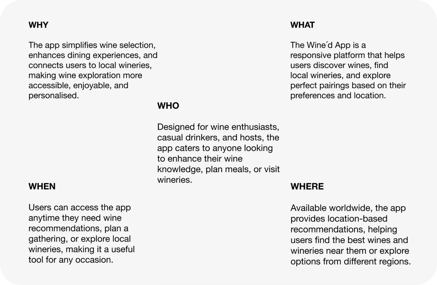
Information Architecture & App Structure
The information architecture of Wine’d Journey was designed to support clarity, intuitive navigation, and behavioural alignment. Rather than organising the app around industry taxonomy, the structure reflects user intention.
The system is built around four primary modules accessible through persistent bottom navigation:
Discover
Explore / Learn
Collection
Profile
Each module corresponds to a distinct cognitive goal, reducing mental switching costs and preventing feature overload.
1. Discover — Immediate Exploration
Intent: “I want to find a wine quickly.”
This module prioritises fast, intuitive discovery. Users can browse curated themes, filter by flavour profile, or view personalised suggestions. The layout uses card-based previews with minimal metadata to support quick scanning.
Key characteristics:
Taste-based filters
Occasion-based categories
Featured and seasonal highlights
Recommendation prompts
Discover reduces decision friction by guiding users toward relevant choices without requiring prior wine knowledge.
2. Explore / Learn — Structured Knowledge
Intent: “I want to understand wine better.”
This section introduces structured educational pathways organised by:
Regions
Grape varieties
Taste characteristics
Food pairings
Content is layered to support progressive learning. Users can move from overview summaries to deeper contextual information without leaving the core experience.
This separation ensures that learning feels optional and guided rather than mandatory or overwhelming.
3. Collection — Personal Ownership
Intent: “I want to save and organise my preferences.”
The Collection module functions as a personal wine journal. It includes:
Saved wines
Custom lists (e.g., “Try Next,” “Dinner Party”)
Notes and ratings
Viewing history
By isolating collection from browsing, the app avoids clutter while encouraging long-term engagement. This module transforms the experience from transactional selection into ongoing personal curation.
4. Profile — Preference & Personalisation Control
Intent: “I want to customise my experience.”
The Profile module houses:
Taste preference settings
Dietary or pairing preferences
Notification management
Accessibility adjustments
This area ensures that personalisation remains transparent and user-controlled rather than algorithmically opaque.
Structural Design Principles
The architecture is guided by three core principles:
(1) Intention-Based Segmentation
Each module reflects a clear mental model: discover, learn, collect, or adjust.
(2) Separation of Browsing and Ownership
Browsing and saving occur in different contexts to prevent cognitive clutter.
(3) Progressive Engagement Depth
Users can engage at surface level or dive deeper without forced transitions.
Architectural Outcome
The result is a system that feels calm, predictable, and purpose-driven. Users are never forced into technical categories; instead, they move through the experience based on curiosity and intent.
This architecture supports both quick decisions and long-term engagement, reinforcing the overall design strategy of transforming complexity into confidence.
Design Strategy
To address the challenges of technical intimidation, information overload, and passive browsing, Wine’d Journey was guided by a human-centred design strategy focused on clarity, confidence, and emotional accessibility.
Rather than simplifying wine itself, the strategy reframed how wine is presented and navigated. Four core principles shaped the system architecture and interface decisions.
1. Taste-First Navigation
Traditional wine platforms categorise by grape variety, region, or production method. While accurate, this structure assumes prior knowledge and creates friction for casual users.
Wine’d Journey reverses this logic.
Users explore through:
Flavour profiles (fruity, dry, bold, crisp)
Mood (light & fresh, rich & comforting)
Occasion (dinner party, gift, casual evening)
This aligns navigation with how people naturally think about wine — emotionally and experientially rather than technically. By centring taste over taxonomy, the app reduces anxiety and shortens the decision loop.
2. Layered Information Architecture
To prevent cognitive overload, the app applies progressive disclosure. Information is structured in layers:
First layer: What it tastes like
Second layer: Key details (grape, region, vintage)
Third layer: Deeper technical or production notes
This allows users to control their depth of engagement. Beginners can stop at the sensory summary, while enthusiasts can explore further.
The result is clarity without oversimplification.
3. Premium Yet Approachable Aesthetic
Wine carries cultural prestige, and the visual identity needed to reflect sophistication without creating distance.
The interface uses:
Warm, wine-inspired tones
Generous white space
Elegant typography
Clean card-based layouts
The aesthetic communicates refinement while maintaining usability. Rather than overwhelming the user with decorative elements, the design prioritises calm structure and visual breathing room.
This balance supports trust and accessibility simultaneously.
4. Personal Curation as a Retention Mechanism
Many wine apps focus on search and browsing but neglect long-term engagement.
Wine’d Journey introduces:
Save and collection-building features
Personal notes and ratings
“Try Next” lists
Comparison tools
By transforming wine selection into a personal journey rather than a one-time transaction, the app fosters emotional ownership and encourages return visits.
Curation becomes both a functional tool and a behavioural retention strategy.
Strategic Outcome
Together, these principles create a system where wine exploration feels guided, intuitive, and personal.
The design strategy ensures that every interaction — from first browse to saved collection — reinforces the central goal: transforming complexity into confidence.
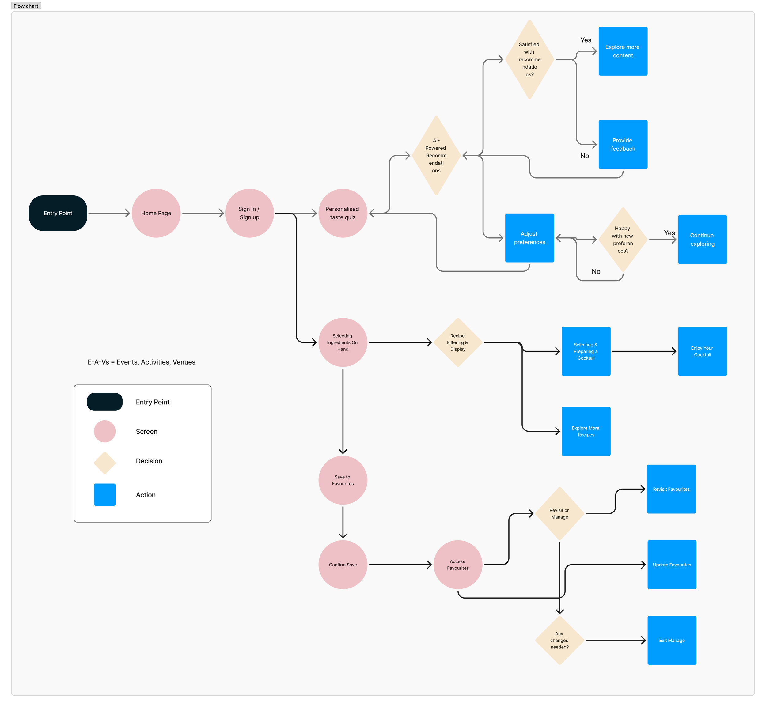
User Flow
The user flows of Wine’d Journey were designed to support intuitive decision-making while maintaining flexibility for different levels of engagement. Rather than enforcing a linear journey, the system allows users to enter from multiple pathways depending on context and intent.
Each flow reflects a distinct behavioural pattern: quick discovery, structured learning, and reflective curation.
1. Discovery Flow
Intent: Immediate selection with minimal effort
Flow:
Home → Filter by Taste / Occasion → Wine Card → Wine Detail → Save / Add to List
This is the shortest and most frictionless path within the app. It is optimised for users who want a quick recommendation or are making a purchase decision in real time.
Design considerations:
Filters prioritise flavour and mood rather than technical attributes
Wine cards display essential taste cues only
“Save” actions are visible without requiring deep navigation
The goal is to reduce decision anxiety and shorten the path from curiosity to action.
2. Learning Flow
Intent: Build understanding before deciding
Flow:
Explore → Region / Grape / Pairing → Topic Overview → Related Wines → Wine Detail → Save
This flow supports curiosity-driven exploration. Users can read simplified summaries about a region or grape, then immediately see practical examples (related wines) to connect knowledge with application.
Design considerations:
Educational content is layered and optional
Topic pages avoid overwhelming text blocks
Transition from learning to product view is seamless
This creates a guided yet non-intrusive learning loop.
3. Collection Flow
Intent: Reflect, compare, and personalise
Flow:
Collection → Saved Wines / Custom List → Wine Detail → Add Notes / Compare → Decision
The Collection module introduces a reflective layer to the experience. Users can revisit saved wines, compare options, and add personal notes.
Design considerations:
Saved wines are organised clearly
Comparison is simple and visually structured
Notes encourage long-term memory building
This flow transforms wine selection from a one-time action into a cumulative journey.
Structural Flow Principles
The user flow system follows three key principles:
1. Short Decision Loops
No essential action requires more than a few steps.
2. Optional Depth
Users can engage deeply without being forced into complex pathways.
3. Continuous Engagement Loop
Discover → Save → Reflect → Re-discover
This cyclical structure encourages retention and repeated use.
Flow Outcome
The resulting experience feels flexible yet structured. Whether users seek immediate guidance or deeper knowledge, the system supports their intention without overwhelming them.
Wine’d Journey ensures that exploration remains intuitive, confident, and personally meaningful.
Project Overview
Wine’d Journey is a thoughtfully designed wine discovery app that transforms wine exploration into an intuitive and inspiring experience. The app combines clean, elegant aesthetics with a structured user journey, making the world of wine approachable for both beginners and enthusiasts.
The interface features a warm, sophisticated colour palette paired with refined typography and balanced layouts. These design choices create a welcoming atmosphere while maintaining a sense of premium quality. Intuitive navigation and responsive interactions ensure that users can move seamlessly between discovery, learning, and personal collection-building.
By blending visual elegance with usability, Wine’d Journey encourages users to explore confidently, deepen their knowledge, and let their taste preferences guide the journey. The result is a digital experience that feels curated, refined, and effortlessly engaging.
Wireframes
The wireframing phase translated strategic principles and user flows into structured screen layouts. At this stage, the focus was not visual styling, but hierarchy, clarity, and interaction logic.
Low-fidelity wireframes were used to validate information placement, reduce cognitive friction, and ensure that navigation aligned with user intent before introducing visual aesthetics.
1. Home / Discover Wireframe
Objective: Enable immediate, low-effort wine discovery.
The Discover screen was structured using a modular card system:
Top section: Taste-based filters (horizontal scroll)
Middle section: Featured wines
Lower section: Occasion-based categories
Design Decisions:
Filters are placed at the top to support quick decision-making.
Wine cards prioritise taste summary over technical details.
Metadata is intentionally minimal to avoid overload.
This layout ensures that users can begin exploring within seconds, without being confronted by dense information blocks.
2. Wine Detail Wireframe
Objective: Present information progressively to prevent overload.
The Wine Detail page follows a layered structure:
Hero section: Bottle image + quick taste summary
Essential details: Grape, region, vintage
Pairing suggestions
Expandable “Learn More” section
Design Decisions:
Taste description appears before technical data.
Expandable sections prevent visual density.
Save button is persistent but unobtrusive.
This structure supports both beginners (who stop at summary) and enthusiasts (who expand deeper content).
3. Explore / Learn Wireframe
Objective: Organise educational content without creating an academic feel.
The Explore screen is structured into:
Categories (Regions, Grapes, Pairings)
Topic previews with short summaries
Related wines displayed below each topic
Design Decisions:
Education is broken into digestible modules.
Text blocks are limited in length.
Transition from learning to product view is seamless.
This avoids separating knowledge from application.
4. Collection Wireframe
Objective: Encourage ownership and reflection.
The Collection screen includes:
Saved wines grid
Custom lists
Quick-access notes and rating indicators
Design Decisions:
Clear visual grouping of saved items.
Notes are accessible without deep navigation.
Comparison view simplified into side-by-side layout.
This transforms passive browsing into structured curation.
Structural Validation
During wireframing, three principles were continuously tested:
Can users complete a task in minimal steps?
Is the primary action visually clear?
Is any information competing unnecessarily?
By resolving structural complexity at the wireframe stage, the final visual design could remain clean and elegant without compensating for architectural issues.
Wireframe Outcome
The wireframes confirmed that:
Taste-first navigation reduces decision anxiety.
Progressive disclosure prevents cognitive overload.
Separating browsing from collection enhances clarity.
This phase ensured that the system was logically sound before introducing colour, typography, and visual refinement.

The colour system of Wine’d Journey was developed to evoke warmth, refinement, and sensory depth while maintaining clarity and usability. Because wine carries strong emotional and cultural associations, the palette was designed not only for aesthetic appeal, but also to reinforce the experiential nature of the product.
The core palette draws inspiration directly from wine tones and tasting environments.
Primary Wine-Inspired Palette
The foundational colours include:
Deep Magenta
Dusty Rose
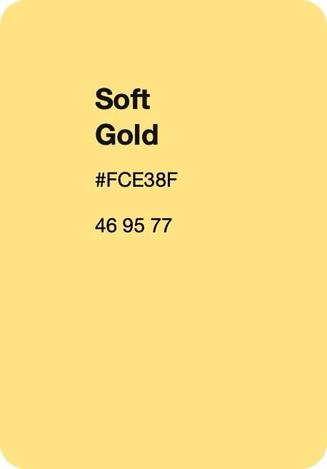
Soft Gold
These tones reflect the richness, warmth, and heritage associated with wine culture.
Deep Magenta functions as the anchor colour. It conveys depth, sophistication, and maturity. Used strategically for primary call-to-action elements and emphasis states, it reinforces the premium positioning of the app.
Dusty Rose introduces warmth and approachability. It softens the overall aesthetic and prevents the interface from feeling overly formal or rigid. This tone supports emotional accessibility, especially for beginner users.
Soft Gold acts as an accent colour, subtly referencing luxury and celebration without appearing excessive. It is applied sparingly to highlight key interactive elements or curated features, reinforcing the refined character of the brand.
Together, these tones establish a cohesive identity rooted in wine’s sensory and cultural context.
Supporting Neutral & Structural Palette
To balance richness with usability, the primary colours are supported by:
Light Lemon
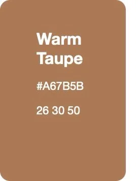
Warm Taupe
Dark Sienna
These colours function as structural stabilisers within the interface.
Light Lemon introduces brightness and contrast. It enhances readability in lighter sections and supports visual separation without relying on stark white, maintaining warmth across the interface.
Warm Taupe serves as a neutral background foundation. It reduces visual harshness and provides breathing space around wine imagery and text content.
Dark Sienna grounds the system. It offers depth for typography, dividers, and secondary emphasis while remaining softer than pure black. This improves visual comfort during extended browsing.
Hierarchy & Functional Application
The palette is applied with intention to support visual hierarchy:
Primary actions → Deep Magenta
Secondary highlights → Soft Gold
Background surfaces → Warm Taupe
Content separation → Light Lemon
Typography emphasis → Dark Sienna
This controlled distribution ensures that colour guides user attention rather than overwhelming it.
Emotional & Experiential Alignment
Wine selection is often emotional rather than purely rational. The palette mirrors this by combining warmth, richness, and softness.
Unlike overly bright or tech-heavy colour systems, this scheme creates a calm, intimate atmosphere — similar to a wine bar or curated tasting environment. The interface feels inviting rather than transactional.
Accessibility Considerations
Despite its warmth, the palette maintains sufficient contrast between text and background elements to support readability. Dark Sienna is used strategically to enhance legibility, particularly in body text and metadata.
Colour is never the sole indicator of action; icons and typography reinforce meaning to ensure clarity.
Colour Strategy Outcome
The final colour system strengthens the brand identity of Wine’d Journey as refined yet approachable. It enhances emotional resonance, supports hierarchy, and maintains usability.
By grounding the interface in wine-inspired tones while balancing them with structured neutrals, the app achieves a premium aesthetic without sacrificing clarity.
Colour Strategy


Typography System
Typography in Wine’d Journey was designed to balance refinement, readability, and emotional warmth. Because wine culture carries heritage and sophistication, the type system needed to reflect elegance without sacrificing clarity or accessibility.
Wine’d Journey employs a refined yet approachable typographic system that aligns seamlessly with the app’s sophisticated yet welcoming identity. Headings are set in a stylish, subtly expressive serif typeface that reflects the richness and tradition of wine culture. This adds character and depth while maintaining restraint.
Body text is presented in a clean, modern sans-serif typeface to ensure optimal readability across devices. Its simplicity supports clarity and prevents visual overload, particularly when presenting tasting notes and detailed wine information.
The typography strategy combines expressive headings with highly legible body text to support both atmosphere and function — maintaining clarity, warmth, and a sense of discovery throughout the experience.
1. Typeface Selection Strategy
The system is built on a complementary pairing:
Elegant Serif for Headings
Clean Sans-Serif for Body Text
The serif typeface is used for wine names, section headers, and curated content titles. Its subtle contrast and refined curves evoke tradition and craftsmanship — qualities closely associated with wine heritage.
The sans-serif typeface is used for descriptions, metadata, and functional UI elements. Its clean geometry ensures legibility across screen sizes and prevents the interface from feeling overly decorative.
This pairing allows the brand to feel premium while maintaining usability in a digital environment.
2. Hierarchy & Information Structure
Given the layered content strategy of the app, typography plays a critical role in guiding user attention.
The hierarchy is structured as follows:
H1 – Wine Name / Primary Titles
Largest size
Serif typeface
Strong visual presence
Anchors the page immediately
H2 – Section Headers (Taste Profile, Pairings, Region)
Slightly reduced scale
Clear separation from body text
Defines structured content blocks
Body Text – Descriptions & Notes
Sans-serif
Optimised line length
Comfortable line spacing for extended reading
Metadata – Grape, Vintage, ABV, Price
Smaller scale
Reduced visual weight
Designed for scanning rather than reading
This hierarchy ensures that users can quickly extract essential information while maintaining the option to read more deeply.
3. Readability & Cognitive Comfort
Wine’d Journey prioritises progressive disclosure. Typography supports this by:
Maintaining controlled line length
Avoiding dense paragraph blocks
Using spacing to create visual breathing room
Ensuring clear contrast between headings and body text
Rather than presenting long technical descriptions upfront, the typographic system visually reinforces layered content — guiding users naturally through information.
4. Emotional Alignment
The serif headings subtly echo wine labels and printed tasting menus, reinforcing authenticity and tradition. However, decorative or script styles were intentionally avoided to prevent visual clutter.
The sans-serif body text introduces modernity and balance, preventing the interface from feeling nostalgic or overly formal.
This balance reflects the core positioning of Wine’d Journey: heritage translated into a contemporary digital experience.
5. Cross-Platform Adaptation
Typography is adapted slightly across platforms:
iOS leverages SF Pro as the base system font where appropriate
Android aligns with Roboto for native consistency
The serif display typeface remains consistent across both platforms to preserve brand identity, while system fonts ensure performance, accessibility, and familiarity.
Typography Outcome
The final typography system enhances clarity, hierarchy, and emotional tone. It reinforces the app’s premium identity while supporting usability across varying levels of wine knowledge.
By combining elegance with functional readability, the type system transforms wine information into an accessible and inviting digital experience.
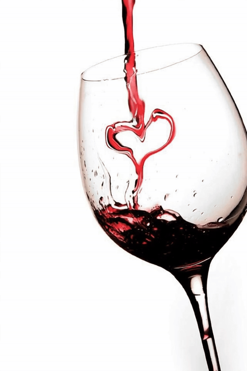
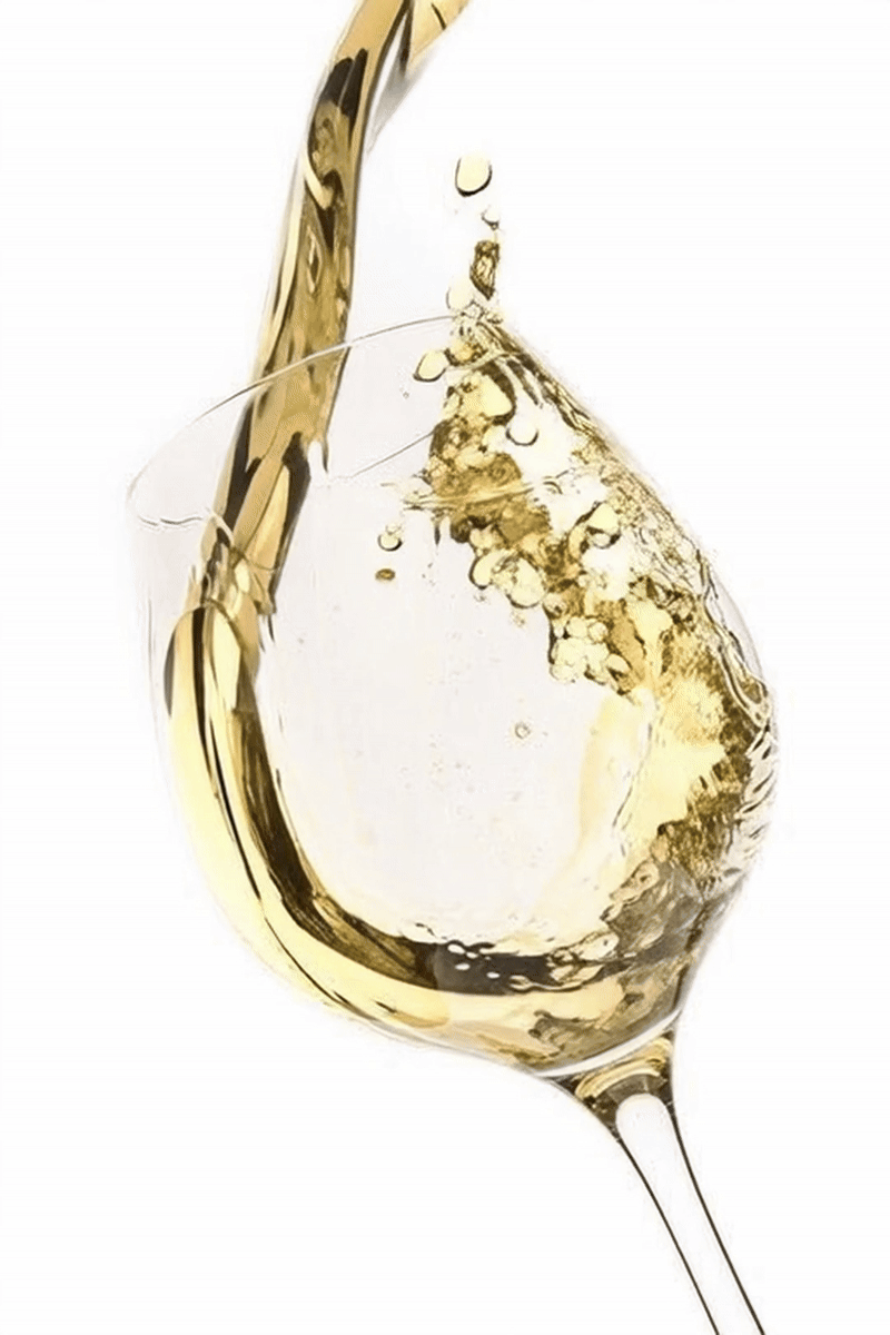
Imagery & Framing
Imagery in Wine’d Journey is treated as the emotional core of the experience. Because wine selection is highly visual and sensory, the framing system was designed to highlight texture, colour, and atmosphere while maintaining structural clarity.
The goal was to create a visual environment that feels curated rather than commercial — inviting exploration without overwhelming the user.
1. Bottle-First Visual Hierarchy
Wine bottle imagery is given primary visual weight across preview cards and detail pages. The bottle is positioned centrally with controlled padding to ensure:
Clear silhouette recognition
Balanced negative space
Visual stability within the grid
Rather than tightly cropping images, the system preserves full bottle proportions to maintain authenticity and product integrity.
This approach reinforces trust and mirrors real-world selection behaviour.
2. Framing Consistency
To maintain rhythm and predictability, all standard wine cards follow a consistent framing structure:
Image anchored at the top
Equal spacing on all sides
Controlled shadow or depth separation
Rounded corner treatment aligned with the grid system
This consistency allows users to scan multiple wines quickly without visual disruption.
In contrast, the Regional Wine pages introduce circular framing inspired by the form of wine droplets. The rounded presentation softens the interface and subtly echoes the organic flow of poured wine.
The circular framing differentiates thematic exploration from transactional browsing while preserving overall structural coherence.
3. Atmospheric Background Integration
Wine card backgrounds feature subtle linear gradients transitioning from deep red wine tones to champagne-inspired hues. These gradients are intentionally soft and low in contrast.
Their purpose is to:
Reinforce the sensory richness of wine
Create emotional warmth
Differentiate wine styles visually
Avoid flat, catalogue-like presentation
Importantly, the gradients never overpower the bottle image. They act as atmospheric context rather than decorative dominance.
4. Visual Breathing Space
Imagery is surrounded by generous white space (or warm neutral space) to avoid visual congestion. This breathing room:
Enhances perceived premium quality
Supports slower, considered browsing
Reduces cognitive density
The spacing mirrors the experience of viewing bottles displayed in a curated wine bar or tasting room.
5. Functional Clarity
Imagery is never overloaded with text overlays. Instead:
Essential information appears below the image
Interaction elements remain distinct
Visual and functional layers are separated
This ensures that the sensory appeal of wine remains uninterrupted.
Imagery & Framing Outcome
The final imagery system balances elegance with usability. Structured framing, restrained gradients, and consistent proportions create a visually cohesive experience that feels curated, immersive, and refined.
By allowing wine imagery to lead while maintaining disciplined layout control, the design supports both emotional engagement and confident decision-making.

Layout & Grid System
The layout system of Wine’d Journey was designed to create an inviting, refined, and intuitive browsing experience. Because wine exploration can easily become information-heavy, the grid structure prioritises clarity, breathing space, and structured hierarchy.
Rather than filling the screen with content, the layout intentionally creates rhythm and visual pauses — mirroring the slow, considered nature of wine tasting itself.
1. Structural Grid Foundation
The interface is built on a consistent modular grid system that supports predictability and alignment across screens.
Key structural principles include:
Consistent horizontal margins
Clear vertical spacing increments
Card-based modular components
Aligned image and text baselines
This grid ensures that content feels organised and stable, reducing cognitive strain during extended browsing.
The modular approach also allows scalability as new categories, features, or recommendation blocks are introduced.
2. Generous Use of White Space
White space is treated as a functional design element rather than empty space.
Its purpose is to:
Separate content layers clearly
Highlight wine imagery
Improve readability
Create a premium, uncluttered feel
Instead of tightly packed lists, wine cards are spaced deliberately to allow each bottle to “breathe.” This enhances visual focus and reinforces the curated identity of the app.
The restrained use of space prevents the interface from feeling transactional or catalogue-like.
3. Card-Based Content Structure
The primary content pattern uses structured cards for:
Wine previews
Topic summaries
Pairing suggestions
Saved items
Each card follows consistent proportions:
Image positioned prominently at the top
Title and key metadata placed directly below
Optional quick actions (Save / Compare) clearly accessible
This predictable structure reduces learning time, strengthens visual rhythm, and supports rapid scanning behaviour across discovery and collection flows.
To reinforce the sensory identity of the product, wine cards feature subtle linear gradient backgrounds transitioning from deep red wine tones to champagne-inspired hues. This colour transition symbolically represents the diversity of wine styles — from bold reds to sparkling varieties — while adding warmth and depth to the interface.
The gradient is applied with low saturation to avoid visual distraction, ensuring that bottle imagery and typography remain the focal point. Rather than acting as decoration, the colour shift provides atmospheric context and enhances category differentiation.
On the Regional Wine pages, the card format adapts into a rounded, circular presentation. The circular framing draws inspiration from wine droplets, subtly echoing the organic movement of poured wine. This variation adds emotional character while maintaining alignment with the grid system.
Together, structured proportions, restrained gradients, and selective shape variation create a cohesive yet expressive content system.
4. Hierarchy Through Layout
The layout reinforces information hierarchy through:
Scale differences
Spacing variation
Visual grouping
Section segmentation
Primary content (wine imagery and names) carries the strongest visual weight. Secondary information (grape, region, vintage) is placed beneath with reduced emphasis. Tertiary details remain expandable or visually separated.
This prevents simultaneous information overload and supports progressive disclosure.
5. Responsive & Cross-Platform Adaptation
The grid system adapts fluidly across screen sizes while maintaining consistent proportions.
On iOS, spacing aligns with Apple’s human interface rhythm, creating visual symmetry and balance.
On Android, layout spacing respects Material Design principles, with slightly stronger structural grouping and elevation cues.
Despite platform nuances, the core grid logic remains unified — ensuring brand consistency while preserving native usability.
6. Emotional & Experiential Considerations
The layout was intentionally designed to feel calm and measured. Unlike fast-paced e-commerce interfaces, Wine’d Journey encourages considered exploration.
Balanced spacing, centred compositions, and consistent alignment create a sense of order and refinement — reinforcing the emotional tone of sophistication without intimidation.
Layout Outcome
The Layout & Grid System transforms wine discovery into a structured yet breathable experience. Through modular design, generous white space, and disciplined hierarchy, the interface supports both quick decision-making and deeper exploration.
The grid ensures that elegance is achieved through structure — not decoration.
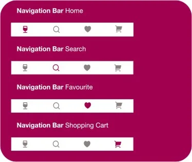
Iconography System
The iconography of Wine’d Journey was designed to support clarity, reinforce hierarchy, and enhance usability without competing with the app’s refined aesthetic. Because the product positions itself as premium yet approachable, the icon system needed to feel elegant, minimal, and intuitive.
Rather than decorative elements, icons function as navigational and cognitive anchors.
1. Minimal & Line-Based Style
The icon system adopts a clean, line-based style with consistent stroke weight and rounded edges. This approach ensures:
Visual harmony with the typography
Reduced visual noise
Scalability across screen sizes
Accessibility at smaller touchpoints
Filled or overly complex icons were intentionally avoided to maintain the calm, spacious interface.
The simplicity of the line style mirrors the app’s goal of reducing cognitive overload.
2. Functional Clarity Over Ornament
Icons are used selectively and purposefully. Each icon must:
Represent a clear action
Be instantly recognisable
Avoid ambiguity
Primary functional icons include:
Save / Bookmark
Filter
Search
Compare
Add to List
Profile
No icon is used purely for decoration. Every symbol has a behavioural function aligned with user flow.
3. Consistency & System Rules
To maintain cohesion, the icon system follows strict design rules:
Uniform stroke thickness
Consistent corner radius
Standardised grid alignment
Balanced spacing around icons
Icons align with the grid system to ensure predictable placement across screens. This structural consistency reinforces usability and reduces subconscious friction.
4. Emotional Alignment
While functional, the icons subtly reflect the tone of the product. Rounded edges soften the interface, supporting approachability. Sharp or aggressive visual elements were avoided to prevent the app from feeling technical or transactional.
The iconography complements the warm colour palette and elegant typography without drawing unnecessary attention.
5. Platform Adaptation
Icons are adapted slightly to respect platform conventions:
iOS versions align with Apple’s Human Interface guidelines
Android versions respect Material Design spacing and interaction feedback
This ensures that the app feels native while preserving brand cohesion.
Iconography Outcome
The final icon system enhances usability through clarity and restraint. It supports navigation, reduces decision friction, and strengthens the premium identity of Wine’d Journey.
By maintaining simplicity and structural consistency, iconography reinforces the app’s broader design philosophy: elegance through reduction.

Final UI Screens


The final UI of Wine’d Journey brings together structured wireframes, a refined visual system, and taste-led interaction logic into a cohesive, immersive experience.
Each screen reflects the core design principles: clarity, warmth, progressive disclosure, and emotional accessibility.
1. Home / Discover Screen
The Discover screen serves as the entry point for intuitive exploration.
Key elements include:
Taste-based filter chips positioned at the top
Gradient wine cards transitioning from deep red to champagne tones
Clean, vertically stacked modular sections
Clear primary actions (Save / Explore)
The layout balances hierarchy and breathing space, ensuring that users can begin exploring within seconds. The warm palette and rounded card structure soften the interface while maintaining structural precision.
This screen demonstrates how aesthetic refinement and usability coexist.
2. Wine Detail Screen
The Wine Detail page embodies progressive disclosure.
The upper section features:
Prominent bottle imagery
Wine name in serif display type
Immediate taste summary
Below, information unfolds in structured layers:
Essential metadata (grape, region, vintage)
Pairing suggestions
Expandable deeper notes
The interface avoids dense paragraphs, instead guiding users through digestible sections. The deep magenta primary action remains visible without overwhelming the composition.
This screen transforms technical wine information into a confident, guided experience.
3. Explore / Regional Screen
The Explore section introduces circular regional cards inspired by wine droplets.
This visual shift differentiates thematic learning from transactional browsing. The rounded framing and subtle gradient backgrounds create a softer, more immersive browsing environment.
Each region page combines:
Brief contextual overview
Related wines
Seamless transition back to product detail
The result is educational content that feels curated rather than academic.
4. Collection Screen
The Collection module reinforces personal ownership.
Saved wines are displayed in a clean grid with consistent proportions and subtle depth separation. Users can:
Review saved bottles
Add personal notes
Compare selections
Organise lists
The restrained colour palette ensures that the focus remains on the user’s curated journey rather than interface decoration.
Visual Cohesion Across Screens
Across all screens, several elements remain consistent:
Elegant serif headings paired with clean sans-serif body text
Structured spacing and modular alignment
Warm neutral backgrounds with wine-inspired accents
Clear visual hierarchy through scale and contrast
This cohesion ensures that the experience feels unified rather than fragmented.
Final UI Outcome
The final interface achieves the intended balance between sophistication and accessibility. The design translates the complexity of wine into a guided, emotionally resonant digital experience.
By combining taste-first navigation, disciplined layout structure, and refined visual styling, Wine’d Journey transforms wine discovery into an inviting and confident journey.
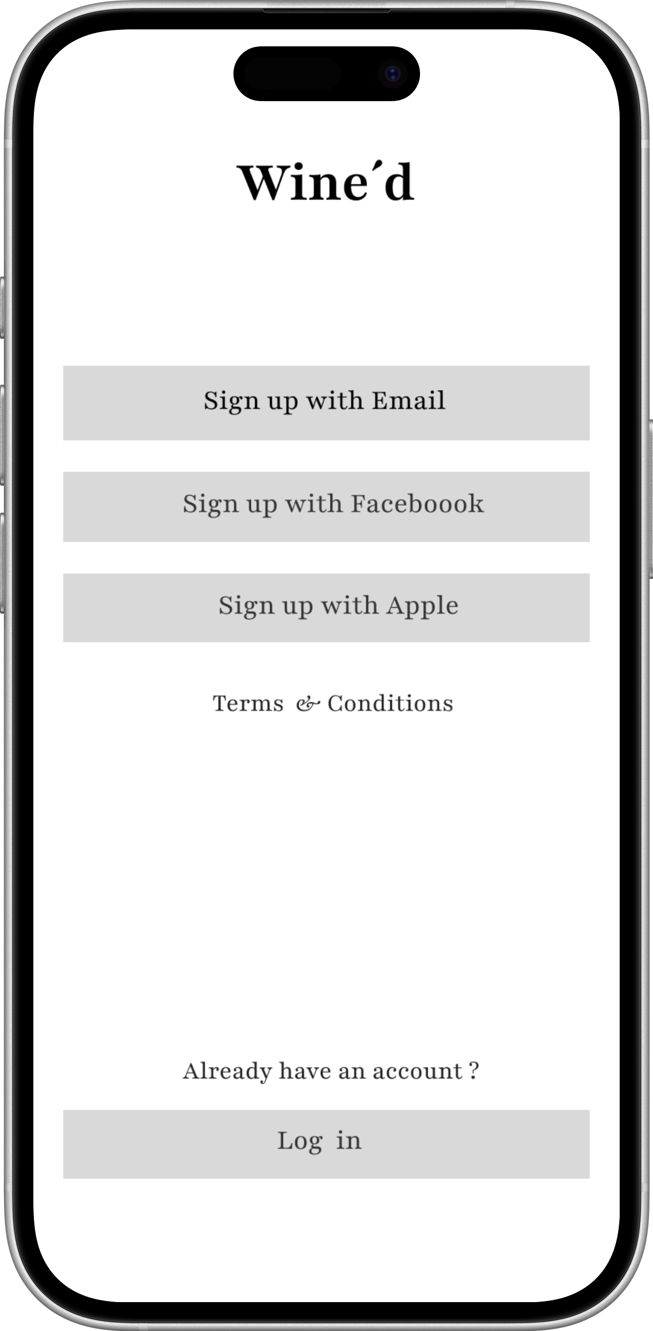
Sign in
The Wine’d Journey Sign-In Page welcomes users with an elegant, wine-inspired design that reflects the app’s sophisticated spirit. At the center, the Wine’d Journey logo, styled in the refined Yeseva One font, is displayed prominently in a deep red wine hue, capturing the essence of exploration and taste. Beneath the logo, the tagline “Let Your Taste Lead Your Way” embodies the app’s mission of guiding users through a personalized wine experience.
Users can easily sign in or sign up via traditional email input fields or quickly connect through Facebook or Apple accounts, streamlining the onboarding process. The combination of warm, rich colors and modern layout design creates a welcoming, premium feel that sets the tone for the journey ahead.
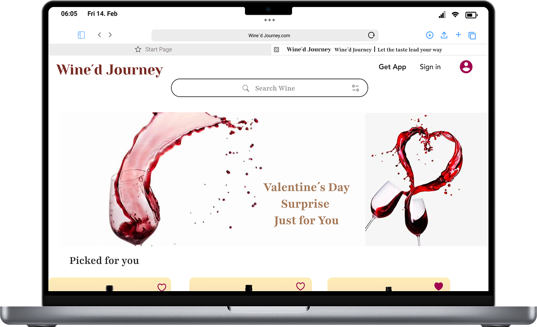
Home Page
The Wine’d Journey Home Page combines elegance and functionality to create a refined browsing experience for wine lovers. At the top, the Wine’d Journey logo is displayed alongside a hamburger menu, account icon, and a search bar with an integrated filter option, making navigation simple and intuitive. Just below, advertisement banners highlight the latest promotional activities, keeping users informed of exclusive offers.
Scrolling down, the “Picked for You” section is presented in a horizontal scroll, showcasing personalized wine recommendations tailored to the user’s taste. Additionally, a “Pairing with Dish” feature suggests ideal wine pairings for specific dishes, enhancing the user’s culinary journey. The clean, wine-inspired color palette and structured layout reflect the app’s premium spirit while ensuring effortless discovery.
Hamburg Menu
The Hamburger Menu Page in Wine’d Journey provides a well-structured, wine-inspired navigation experience. Organized into distinct sections, it allows users to explore wines by style—including Red, White, Champagne, and other varietals. A Wine Grapes category helps users discover wines based on their grape variety, while the Regional Choice option organizes selections by vineyard locations and wine-producing areas around the world. Additionally, a Dish Pairing section offers curated recommendations, guiding users to select wines that perfectly complement a variety of cuisines. Designed with elegant typography and a refined color palette, this page makes browsing for the perfect wine intuitive and visually sophisticated.
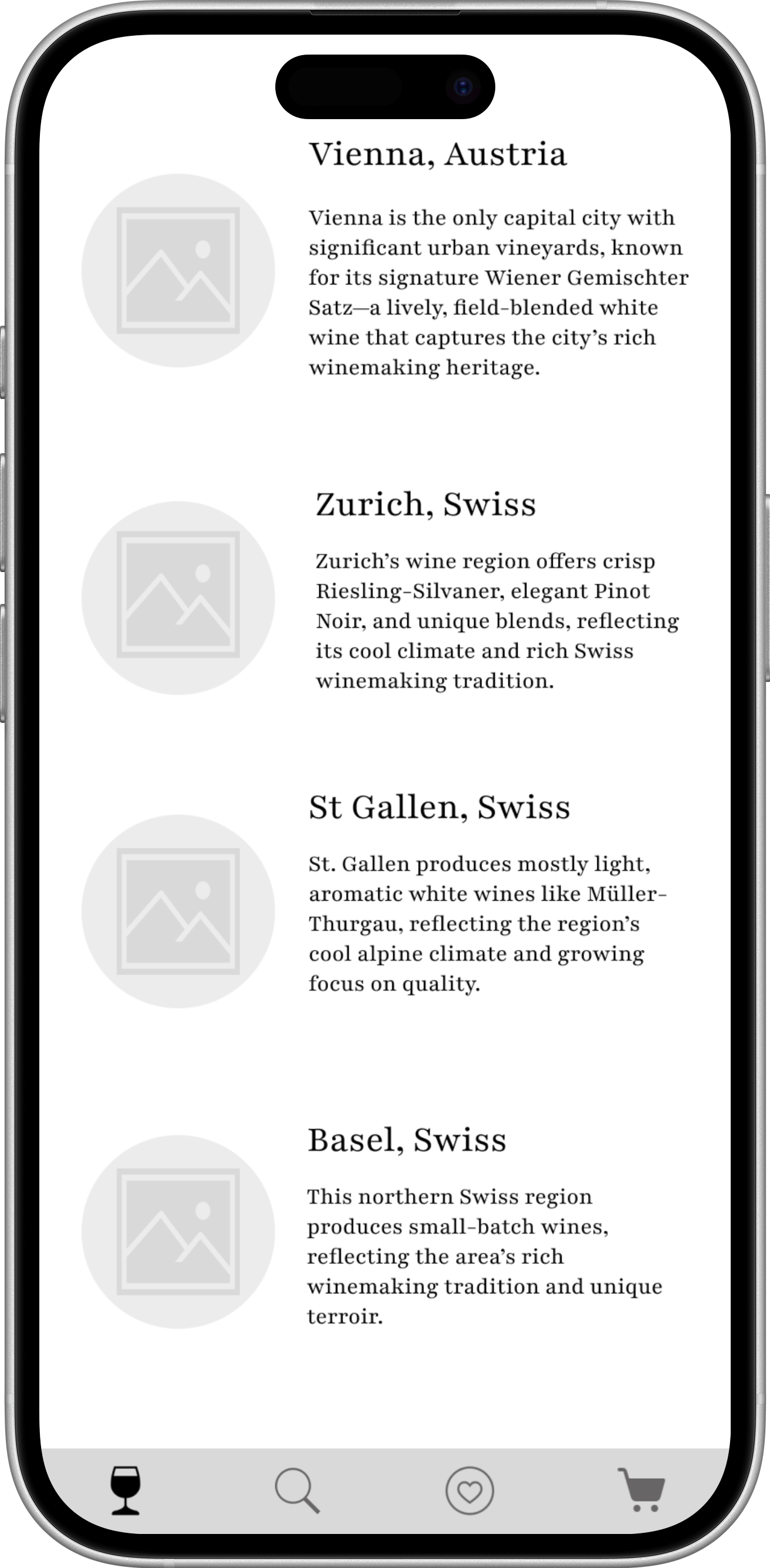
Swiss Regional Choice
The Swiss Regional Choice Page in Wine’d Journey invites users to explore Switzerland’s renowned wine culture through an elegant and visually engaging layout. The page features select locations such as Zurich, St. Gallen, Basel, and more, each represented by round-shaped scenic images that highlight the beauty of local vineyards and landscapes.
Tapping on a location reveals a curated introduction to its regional wines, including signature grape varieties, distinctive flavors, and traditional winemaking methods unique to that area. The clean design and immersive visuals guide users through Switzerland’s rich wine heritage, allowing them to discover and select bottles inspired by both local scenery and authentic regional craftsmanship.
Zurich Wine
The Zurich Wine Page offers a refined showcase of Switzerland’s local wines with a design inspired by the elegance of champagne bubbles. Each wine is presented in a round-framed image set against a soft champagne-colored background, giving the impression of a delicate sparkling wine bubble.
Users can explore essential wine details at a glance, including the brand name, grape variety, vintage year, and a clearly marked price button for easy selection or purchase. This visually engaging layout captures the essence of Zurich’s wine tradition, blending premium aesthetics with intuitive usability, inviting users to savor the richness of Swiss craftsmanship.
Wine Detailed Info
The Wine Detailed Info Page provides an elegant, in-depth view of each wine selection, designed to help users make informed and inspired choices. At the top, the page highlights the wine’s name, production location, vintage year, and alcohol percentage, paired with a high-quality image of the bottle. A prominent gold-accented price button allows users to instantly add the wine to their shopping cart with a single tap.
Further down, a beautifully styled section tells the brand’s story, offering insight into the winemaker’s heritage and philosophy. Detailed content about the grape variety used in the wine enriches the user’s understanding of its flavor profile. The layout combines premium aesthetics with intuitive navigation, delivering a luxurious yet accessible experience for wine enthusiasts exploring each label.
Austria Regional Choice
The Austria Regional Choice Page elegantly showcases the country’s local wine selections through a visually immersive experience. Each featured Austrian location—such as Vienna, Wachau, and more—is represented by round-shaped scenic images, capturing the charm of vineyards, hillsides, and historic cellars.
Tapping on a location opens curated wine recommendations, highlighting regional specialties, grape varieties, and unique winemaking traditions that define Austrian wines. The refined layout, inspired by the circular shape of a wine glass rim, offers a premium, visually rich journey through Austria’s celebrated wine regions, making it easy for users to explore and select their perfect bottle.
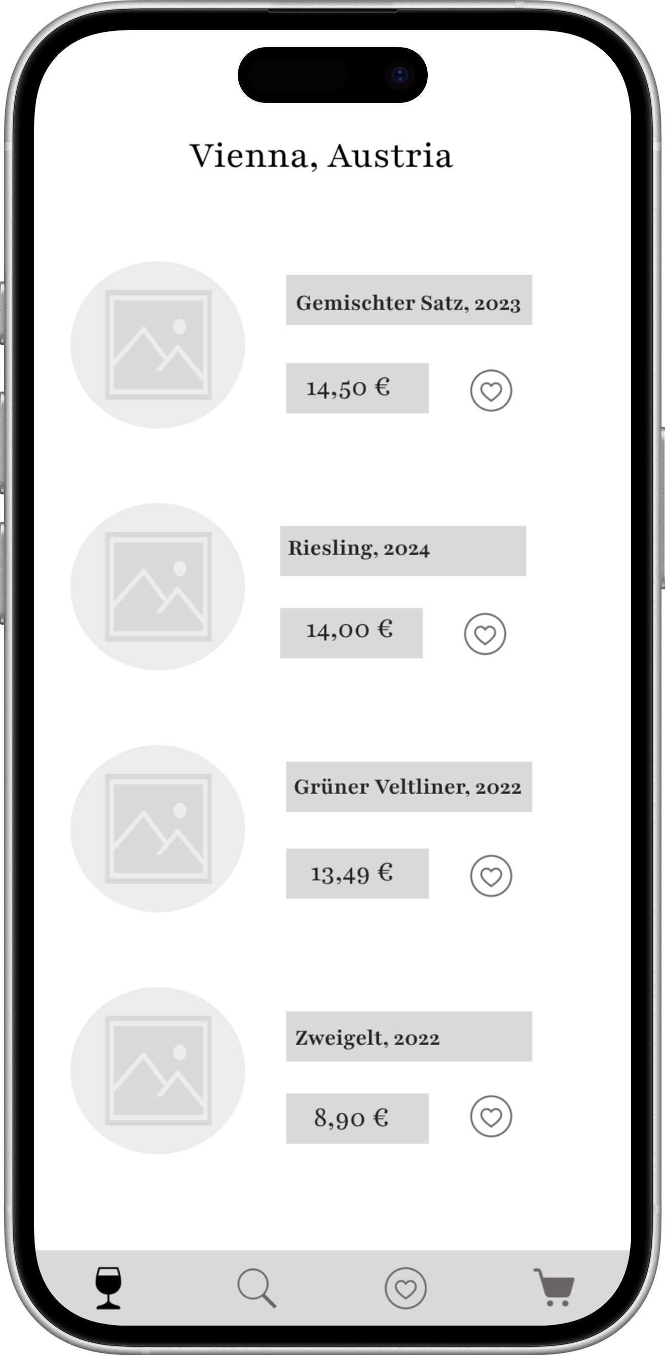
Vienna Wine
The Vienna Wine Page presents a sophisticated showcase of Austria’s distinguished wines, inspired by the graceful charm of Viennese culture and its historic wine taverns. Each bottle is displayed within an elegant oval frame set against a soft ivory and warm beige background, creating a light and inviting atmosphere reminiscent of Vienna’s historic streets and vineyards.
Users can quickly access essential wine information, including the winery name, grape variety, vintage year, tasting profile, and a clearly marked price button for easy selection or purchase. The clean, airy layout blends classic sophistication with intuitive functionality, capturing the essence of Vienna’s wine heritage while offering a smooth and modern browsing experience.

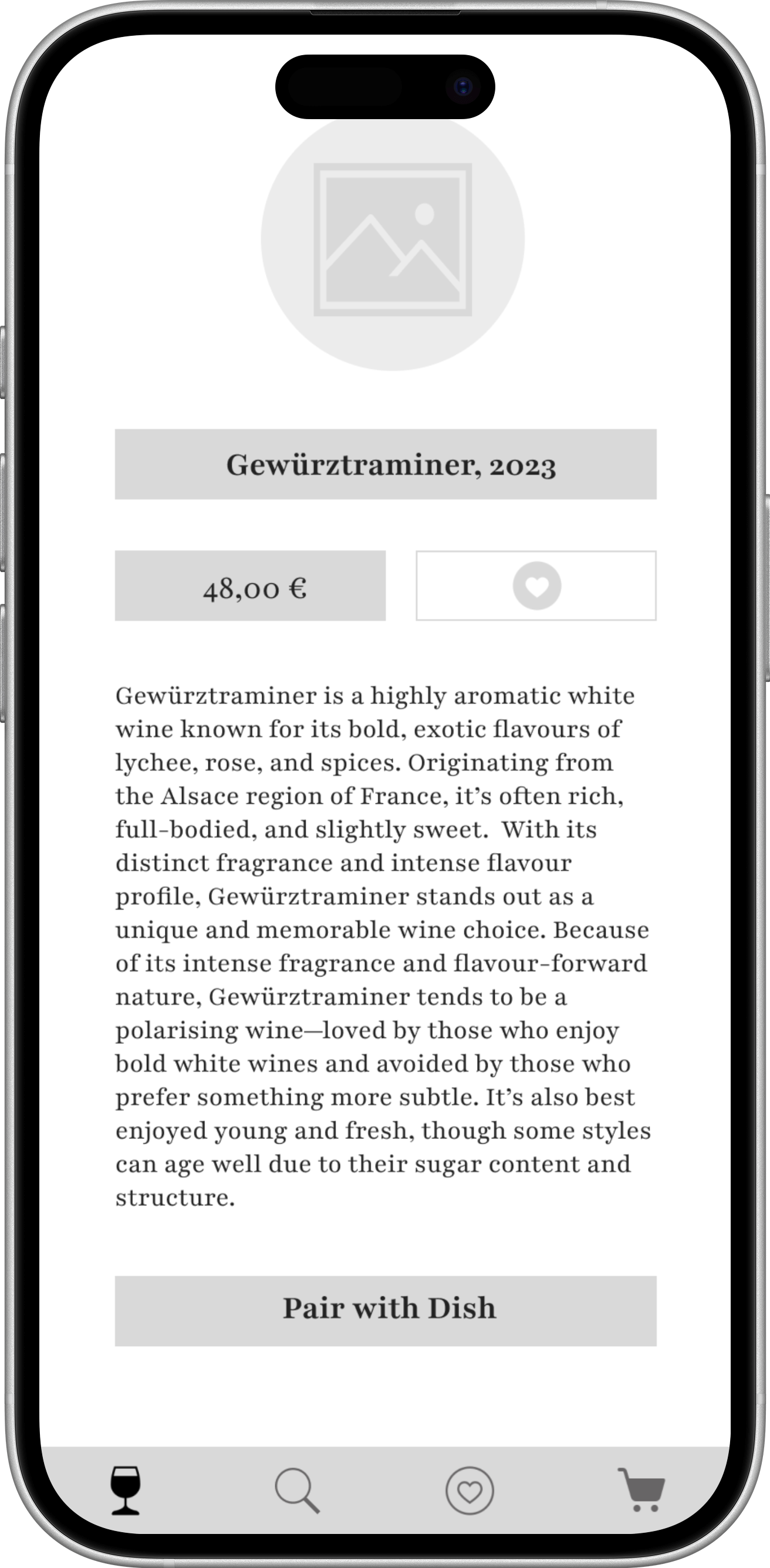
Wine Detailed Info
The Wine Detailed Info Page provides an elegant, in-depth view of each wine selection, designed to help users make informed and inspired choices. At the top, the page highlights the wine’s name, production location, vintage year, and alcohol percentage, paired with a high-quality image of the bottle. A prominent gold-accented price button allows users to instantly add the wine to their shopping cart with a single tap.
Further down, a beautifully styled section tells the brand’s story, offering insight into the winemaker’s heritage and philosophy. Detailed content about the grape variety used in the wine enriches the user’s understanding of its flavor profile. The layout combines premium aesthetics with intuitive navigation, delivering a luxurious yet accessible experience for wine enthusiasts exploring each label.

Search
The Search Page offers users a visually engaging and intuitive way to explore wines. At the top, a sleek search bar with a filter icon allows users to refine their search effortlessly. Below, keyword tag buttons such as White, Red, Riesling, and other varietals make quick filtering simple, while a Most Searched section highlights trending wine terms.
Further down, a Popular Wines list showcases bottles in elegant square frames, featuring color transitions from soft pink wine tones to champagne hues. Users can favorite wines by tapping the heart icon for easy access later. A dedicated Valentine’s Day Surprise section appears in a horizontal scroll, inviting exploration of seasonal wines, with a “View All” option to browse the full selection. This combination of refined design, playful color transitions, and personalized interaction makes discovering wines both delightful and efficient.
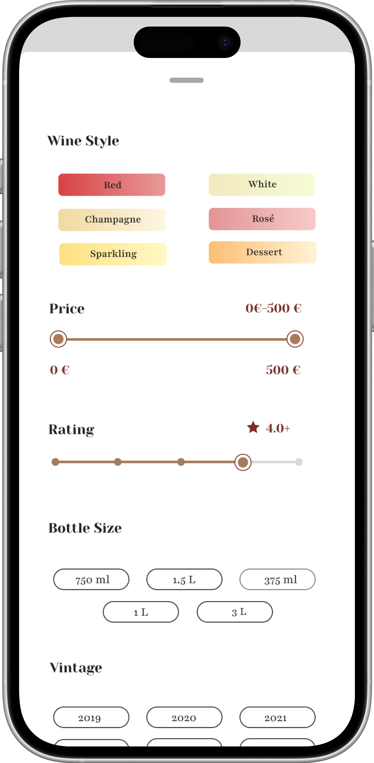
Search Bar Filter
The Search Bar Filter in Wine’d Journey provides a comprehensive, easy-to-use tool for refining wine searches. Users can explore wines by style, including Sparkling, Dessert, Rosé, Red, White, and Champagne, ensuring tailored recommendations.
A price range slider (0–500€) allows precise budget control, while a rating chart (0–5 stars) helps users find top-rated selections. For serving preferences, users can select from various bottle sizes, ranging from 375 ml to 3L, ideal for individual enjoyment or group celebrations. Additionally, a vintage year filter lets users choose wines by their production year, perfect for collectors or those seeking specific aging profiles.
This refined filtering experience, presented with Wine’d Journey’s champagne-toned design and smooth controls, ensures users can quickly navigate and discover wines that perfectly match their taste, occasion, and budget.

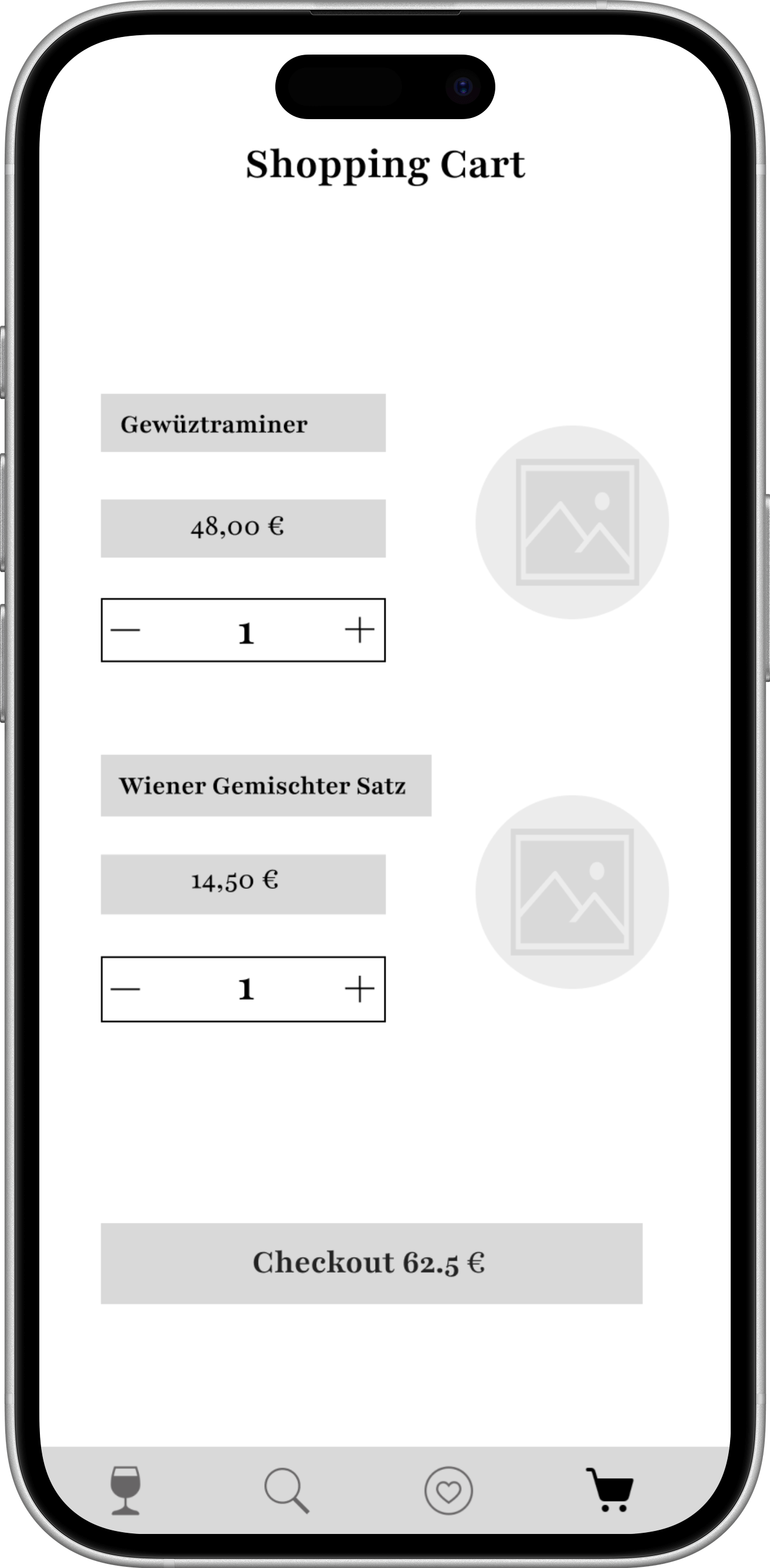
Shopping Cart
The shopping cart page displays each selected wine with its name, grape variety, vintage year, and unit price, along with an input to adjust the purchase quantity. At the bottom, a bold checkout button in rich red wine color invites users to complete their purchase, combining elegant design with a smooth and intuitive shopping experience.

Order
The order page guides users through the final steps of their purchase with a clean, elegant layout. It features interactive click bars for payment method and shipping address, which expand into input fields when selected, allowing users to enter or update their payment information and detailed delivery address. Below, a summary section displays the itemized purchase total, including applicable taxes, ensuring transparency. At the bottom of the page, a prominent “Place Order” button in signature red wine color completes the experience with a refined and confident call to action.

Reflection
Designing Wine’d Journey required balancing emotional richness with structural clarity. Wine is inherently expressive, cultural, and sensory — yet digital interfaces demand precision, hierarchy, and restraint. The core challenge was ensuring that the experience felt warm and immersive without becoming visually heavy or conceptually overwhelming.
Balancing Emotion and Usability
One of the most significant challenges was managing aesthetic depth. Wine-inspired gradients, rounded regional cards, and serif typography introduced strong visual character. However, every expressive decision had to be measured against usability.
Through iteration, I learned that emotional tone should enhance structure — not compete with it. Reducing saturation, increasing white space, and refining typographic hierarchy ensured that the interface remained functional and readable while preserving atmosphere.
This reinforced a key principle: elegance in digital design often comes from disciplined restraint.
Translating Complexity into Confidence
Another challenge was reframing wine knowledge without oversimplifying it. The goal was not to remove technical depth but to reposition it.
By introducing progressive disclosure and taste-first navigation, I shifted the decision-making process from information-heavy to guidance-driven. This required careful information prioritisation and constant questioning of what users truly need at each stage of interaction.
The biggest learning here was that clarity is not achieved by reducing information, but by sequencing it intentionally.
Designing for Multiple User Levels
Supporting both beginners and enthusiasts within the same system required flexible architecture. Instead of creating separate pathways, the layered content model allows users to choose their depth of engagement.
This approach strengthened my understanding of scalable UX systems — designing for adaptability rather than segmentation.
Personal Growth
This project deepened my ability to think beyond screens and into behavioural design. Rather than focusing solely on aesthetics, I considered:
How users feel when making a decision
Where hesitation occurs
How structure influences confidence
How retention can be designed subtly
It strengthened my skills in building cohesive systems where layout, colour, typography, and interaction logic all reinforce a central strategy.
Looking Forward
If further developed, I would explore:
Data-driven taste personalisation
Behavioural analytics integration
Adaptive recommendation systems
Micro-interactions to reinforce sensory feedback
These enhancements would extend the app from a structured exploration tool into a truly intelligent wine companion.
Closing Reflection
Wine’d Journey demonstrates how design can bridge heritage and modernity — translating a culturally rich domain into a clear, accessible, and emotionally resonant digital experience.
More importantly, it reinforced the value of intentional structure. When information is organised thoughtfully, complexity becomes confidence.
Design Impact
Wine’d Journey transforms wine selection from a technical, anxiety-driven task into a confident and emotionally guided experience.
By restructuring information around taste rather than industry taxonomy, the app reduces cognitive friction and empowers users to make decisions based on personal preference rather than assumed expertise.
1. Reduced Decision Anxiety
Through taste-first navigation and progressive disclosure, users are no longer confronted with overwhelming terminology at the point of choice.
Essential flavour cues are prioritised, while deeper technical information remains accessible but optional. This layered approach allows beginners to feel confident while still accommodating enthusiasts.
The result is a more approachable entry into wine culture.
2. Improved Information Clarity
The modular grid, structured hierarchy, and disciplined use of white space prevent visual overload. Each screen has a clear primary focus, ensuring that imagery, metadata, and interaction elements do not compete for attention.
This clarity supports faster scanning behaviour while maintaining a premium aesthetic.
3. Increased Emotional Engagement
The warm colour palette, gradient card backgrounds, and circular regional framing introduce subtle emotional resonance into the interface.
Rather than feeling transactional, the app feels curated and experiential. This shift encourages exploration and repeated engagement.
Wine discovery becomes a journey rather than a one-time purchase decision.
4. Stronger Retention Through Personal Curation
The Collection module introduces behavioural reinforcement by allowing users to save wines, add notes, and compare selections.
This transforms passive browsing into active participation. Over time, users build a personalised archive that reflects evolving taste preferences.
Retention is supported not through gamification alone, but through meaningful ownership.
5. Scalable System Foundation
The structured information architecture and modular layout system ensure scalability.
New regions, seasonal campaigns, curated lists, or recommendation features can be integrated without disrupting hierarchy. The grid and visual system provide a flexible foundation for product growth.
Overall Impact
Wine’d Journey demonstrates how thoughtful UX strategy can reshape a traditionally complex domain into an intuitive, refined, and emotionally accessible digital experience.
By aligning structure, visual identity, and behavioural design, the product shifts wine exploration from confusion to confidence — preserving cultural depth while enhancing usability.
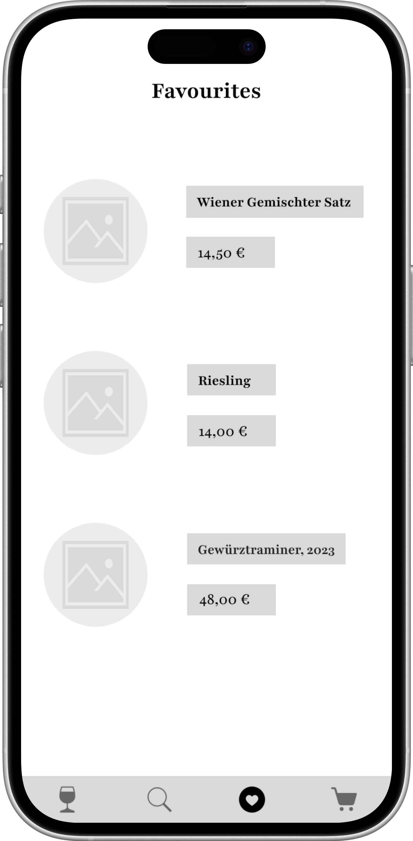
Favourites
The Favourites Page elegantly displays all the wines a user has saved, offering a personalized collection of preferred bottles. Each wine is presented in a round-framed image with a soft gradient background transitioning from pink wine tones to champagne hues, echoing the app’s refined aesthetic.
Below each image, essential details—wine name, grape variety, and vintage year—are clearly listed for quick reference. A prominently styled gold-accented price button allows users to seamlessly revisit or purchase their favorite wines. This page combines visual elegance and practicality, giving users a beautifully organized space to manage and rediscover their wine selections.
Future Improvements
While Wine’d Journey establishes a strong foundation for intuitive wine discovery, several opportunities exist to expand the product into a more intelligent, personalised, and behaviour-driven ecosystem.
The next phase of development would focus on deepening personalisation, increasing engagement, and integrating data-informed optimisation.
1. Intelligent Taste Profiling
Currently, users explore through taste-based filters and curated categories. A future iteration would introduce adaptive taste profiling powered by behavioural data.
By analysing:
Saved wines
Ratings and notes
Browsing behaviour
Filter usage
The system could gradually refine recommendations and surface wines aligned with evolving preferences.
Rather than static suggestions, the app would function as a dynamic taste companion that learns over time.
2. Barcode Scanning & Real-World Integration
To bridge digital exploration with physical retail environments, a barcode scanning feature could be introduced.
Users would be able to:
Scan bottles in-store
Instantly access tasting summaries
Save wines directly to their Collection
Receive pairing suggestions in real time
This would extend Wine’d Journey beyond browsing into real-world decision support, increasing practical utility and retention.
3. Behavioural Analytics & Conversion Optimisation
With GA4 or similar tracking integration, the app could measure:
Drop-off points within discovery flows
Time spent on detail pages
Conversion from browsing to saving
Return frequency and engagement loops
These insights would inform iterative design improvements, ensuring that structure and content continue to align with user behaviour.
Data would serve as validation for design assumptions rather than replace user intuition.
4. Subtle Gamification for Retention
To encourage ongoing engagement without compromising the refined tone, subtle motivational elements could be introduced:
Taste journey milestones
Region exploration progress indicators
Curated seasonal challenges
These features would reinforce learning and discovery while maintaining the calm, premium aesthetic.
5. Social & Community Layer
Future development could include optional social features such as:
Shared tasting lists
Collaborative event planning
Curated recommendations from sommeliers
The challenge would be integrating community elements without disrupting the app’s elegant, curated atmosphere.
6. Expanded Educational Depth
For advanced users, the learning module could expand to include:
Interactive region maps
Production method visualisations
Short educational micro-content modules
This would enhance credibility while preserving progressive disclosure principles.
Strategic Outlook
The long-term vision for Wine’d Journey is to evolve from a structured wine discovery tool into an intelligent, personalised companion that bridges curiosity, confidence, and cultural depth.
Future iterations would prioritise:
Personalisation without complexity
Engagement without distraction
Intelligence without intimidation
By maintaining the balance between emotional warmth and structural clarity, the product can scale while preserving its core identity.