Overview
Melodia is a mobile music app designed to help users discover, stream, and organize their favorite songs through a visually refined and emotionally engaging interface. The app focuses on creating a seamless listening experience where music exploration feels intuitive, personal, and immersive.
Music often carries personal memories—moments, places, and emotions that resurface when a familiar song begins to play. Melodia embraces this connection between music and memory, allowing users to revisit songs that resonate with their personal experiences and emotional history.
This idea is conceptually inspired by the philosophy of Henri Bergson, who described memory as a continuous presence that interacts with the present moment rather than a static record of the past. In a similar way, music listening often brings past experiences into the present, allowing memories to unfold through sound.
Rather than presenting music as a static library of tracks, Melodia encourages discovery through mood-based navigation, curated playlists, and personalized recommendations. By organizing music around emotional tone and listening context, the app helps users find songs that connect with their feelings and memories.
As the UI/UX designer, I led the end-to-end design process—from user research and information architecture to wireframing, visual design, and interactive prototyping in Figma. The goal was to create an interface that balances aesthetic clarity with emotional engagement, allowing users to move effortlessly between discovery, listening, and personal music collections.
The final design integrates a modern visual identity with smooth interaction patterns, creating a digital environment where music flows naturally through exploration, memory, and emotional experience.
“ Duration is the continuous progress of the past which gnaws into the future.”
— Henri Bergson
Music rarely exists only in the present moment. A single song can recall places, emotions, or periods of life that listeners carry with them over time. Philosopher Henri Bergson described memory as a continuous flow—an interaction between past experiences and the present moment.
Melodia was designed with this idea in mind.
Rather than functioning solely as a music player, Melodia explores how digital interfaces can support the emotional and temporal nature of music listening. The app focuses on intuitive discovery, immersive playback, and personal music collections that allow users to reconnect with songs that shape their memories.
Through curated discovery, seamless listening, and an elegant visual environment, Melodia creates a space where music is not just consumed but experienced—allowing listeners to move fluidly between discovering new sounds and revisiting meaningful ones.
The design combines a refined black-and-gold visual identity, clear navigation structures, and carefully balanced layouts to ensure that interaction remains effortless while the music itself remains central.
Melodia therefore positions music listening not simply as a functional activity, but as part of a continuous personal experience where songs, memories, and moments intersect.
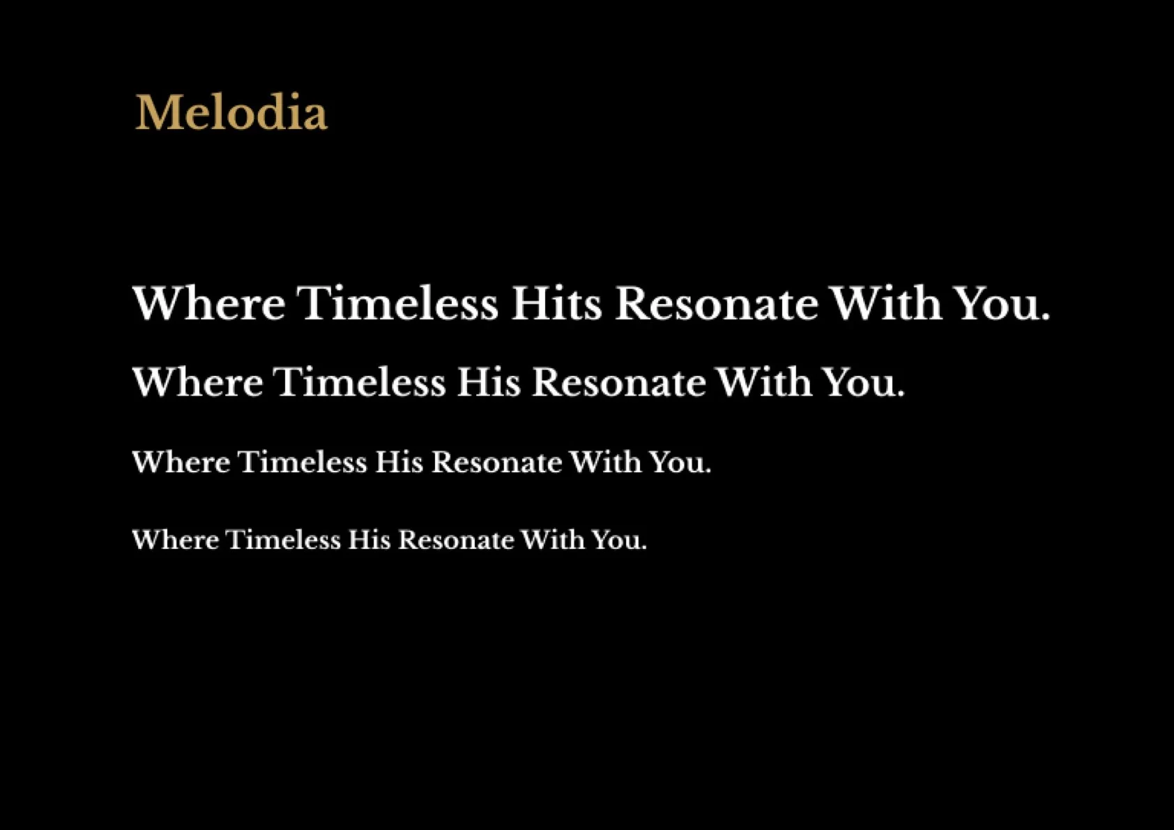
Melodia
Music, Memory, and Duration

Context & Design Objective
Music listening has become deeply integrated into everyday life, yet many digital music platforms primarily focus on large content libraries and algorithmic recommendations. While these systems provide access to vast catalogs of songs, they often treat music as a collection of isolated tracks rather than as a meaningful listening experience connected to personal moments and memories.
For many listeners, music is closely tied to emotion, memory, and atmosphere. A familiar song can instantly evoke past experiences, places, or relationships, transforming listening into something more than simple entertainment. However, many music apps emphasize efficiency and scale over emotional engagement, making it difficult for users to rediscover songs in ways that feel personal and meaningful.
Melodia was conceived as a response to this gap. The objective was to design a music listening experience that prioritizes discovery, emotional connection, and personal memory. Instead of presenting music solely through genres or large libraries, the app encourages exploration through moods, curated selections, and intuitive navigation.
By combining refined visual design with a smooth and immersive listening flow, Melodia aims to transform music streaming into a more reflective and emotionally engaging experience—one that allows users to rediscover songs not only as sound, but as part of their personal history and memories.
Design Objectives
The design of Melodia was guided by a set of strategic objectives aimed at creating a more intuitive, emotionally engaging, and personalized music listening experience. Rather than simply presenting a large catalog of songs, the goal was to design an interface that supports discovery, memory, and meaningful interaction with music.
1. Make Music Discovery More Intuitive
Many music platforms rely heavily on large libraries and algorithmic lists, which can feel overwhelming for users. Melodia focuses on simplifying discovery through clear navigation, curated playlists, and mood-based exploration. This approach allows users to find music more naturally and effortlessly.
2. Strengthen the Connection Between Music and Memory
Music often carries personal memories and emotional associations. The design encourages users to revisit songs that resonate with their experiences by supporting personal collections, favorites, and listening histories. In this way, Melodia treats music not just as content, but as part of a user’s personal story.
3. Encourage Emotional and Contextual Listening
Instead of organizing music solely by genre or artist, Melodia emphasizes exploration through mood, atmosphere, and listening context. This allows users to discover songs that match their feelings, environments, or moments in daily life.
4. Create a Seamless Listening Experience
The interface prioritizes clarity and smooth interaction, allowing users to move effortlessly between discovering music, playing songs, and organizing their personal collections. Clean layouts, intuitive navigation, and clear visual hierarchy ensure that the experience remains fluid and immersive.
5. Balance Aesthetic Design with Usability
Music is both an auditory and emotional experience, so the visual design aims to support that atmosphere. Melodia integrates a refined visual identity with balanced colors, typography, and layout, creating an interface that feels modern, expressive, and enjoyable to use without distracting from the listening experience.
Conceptual Inspiration
Music, Memory, and the Experience of Time
The conceptual foundation of Melodia draws inspiration from the philosophy of Henri Bergson, particularly his reflections on duration and memory. Bergson argued that lived time is not composed of isolated moments but unfolds as a continuous flow in which past and present interpenetrate.
Music offers a powerful example of this experience. A familiar melody can instantly evoke memories, emotions, and personal moments, allowing the past to resonate within the present. In this way, music becomes more than sound; it becomes a medium through which time, memory, and feeling intertwine.
Melodia translates this philosophical perspective into the design of a digital listening experience. Rather than presenting songs as isolated tracks, the interface emphasizes continuity, discovery, and personal connection. Through mood-based exploration, curated playlists, and personal collections, users can navigate music as a living archive of sound and memory.
Target Users & User Needs
Melodia is designed for a diverse group of music listeners who share a common goal: discovering and enjoying music in a way that feels personal, intuitive, and emotionally meaningful. While users may differ in their listening habits, preferences, and musical knowledge, many encounter similar challenges when navigating modern music platforms.
The design of the app focuses on understanding these user groups and supporting their needs during music discovery, listening, and personal collection.
1. Explorative Listeners
Profile:
Users who enjoy discovering new music and exploring different sounds, artists, or moods.
Challenges:
Overwhelming music libraries with too many choices
Difficulty finding music that matches a specific mood or atmosphere
Repetitive algorithmic recommendations
Needs:
Intuitive discovery tools
Curated playlists and mood-based exploration
A visually engaging interface that encourages exploration
For these users, the platform should feel like a space for discovery, where music exploration becomes enjoyable rather than overwhelming.
2. Memory-Driven Listeners
Profile:
Users who associate music with personal memories, emotions, or moments in their lives.
Challenges:
Difficulty rediscovering songs tied to past experiences
Limited tools for organizing music based on emotional connection
Listening histories that feel impersonal
Needs:
Personal collections and favorites
Easy ways to revisit previously loved songs
Features that support emotional and memory-based listening
For this group, music is more than entertainment—it is part of their personal narrative and memories.
3. Casual Everyday Listeners
Profile:
Users who listen to music throughout daily activities such as commuting, working, studying, or relaxing.
Challenges:
Navigating between discovery and playback quickly
Interruptions in the listening flow due to complex navigation
Difficulty finding music suited to different daily contexts
Needs:
Seamless listening flow
Quick access to favorite songs and playlists
Context-based recommendations (mood, activity, atmosphere)
For these users, music should integrate naturally into their daily routines without requiring unnecessary effort.
Shared Core Needs
Across all user groups, several consistent needs emerged:
Intuitive Discovery
Helping users find music naturally without overwhelming them with choices.
Personal Connection
Supporting the emotional and memory-based relationship people have with music.
Seamless Listening Flow
Ensuring smooth transitions between discovery, playback, and personal collections.
Meaningful Organisation
Allowing users to organize and revisit songs that resonate with their experiences.
Melodia’s design addresses these needs by combining mood-based exploration, personalized collections, and a clean listening interface, creating an environment where users can rediscover music not only as sound, but as part of their personal experiences and memories.
Problem Analysis
Although music streaming platforms provide access to vast libraries of songs, many digital music experiences still struggle to support meaningful discovery and personal engagement. Through research and analysis of existing music platforms, several key challenges emerged that affect how users explore, connect with, and revisit music.
1. Overwhelming Music Libraries
Modern streaming services offer millions of tracks, but this abundance can make discovery feel overwhelming rather than inspiring. Users often rely on algorithmic recommendations or popular playlists, which may limit exploration and make it difficult to find music that truly resonates with their personal tastes.
2. Discovery Feels Impersonal
Many music platforms emphasize efficiency and scale, presenting music primarily through charts, genres, or automated recommendations. While these systems help surface popular songs, they often overlook the emotional and personal dimensions of listening, making the experience feel less meaningful.
3. Weak Connection Between Music and Memory
Music is strongly connected to memory and emotion, yet most streaming platforms treat songs as isolated pieces of content. Users may remember songs associated with particular moments in their lives, but existing interfaces rarely support rediscovering music through these personal connections.
4. Fragmented Listening Experience
Navigating between discovering music, playing songs, and organizing personal collections can sometimes feel fragmented. Users may need to move between multiple screens or menus, which interrupts the natural flow of listening.
5. Core Insight
The central challenge in digital music platforms is not simply providing access to music, but creating a listening experience that feels personal, intuitive, and emotionally engaging.
Music is not only sound—it is often tied to memories, moods, and personal experiences. Designing for music therefore requires more than organizing tracks; it requires supporting discovery and listening in ways that resonate with how people emotionally experience music.
Melodia addresses these challenges by designing a music experience centered on mood-based exploration, intuitive discovery, and personal music collections, allowing users to reconnect with songs not only as content, but as part of their personal listening journey.
User Hypothesis
Before developing the design solution, an initial hypothesis was formed to guide the direction of the product and frame assumptions about how people interact with music in digital environments.
We observed that while music streaming platforms offer access to vast libraries of songs, the experience of discovering and revisiting music often feels impersonal and overwhelming. Users may struggle to navigate large catalogs or rediscover songs that resonate with their emotions and memories.
At the same time, music listening is deeply connected to personal experiences. A familiar song can evoke specific moments, places, or feelings, transforming listening into something more meaningful than simply playing tracks from a playlist.
Based on these observations, the hypothesis was:
If music discovery is organized around mood, personal collections, and intuitive exploration rather than large static libraries, users will feel a stronger emotional connection to the music they listen to and will engage more deeply with the platform.
In other words, by designing a listening experience that emphasizes discovery, emotional resonance, and personal memory, Melodia can transform music streaming from passive consumption into a more personal and meaningful interaction with sound.
This hypothesis informed key design decisions, including mood-based exploration, curated playlists, and features that allow users to collect, revisit, and rediscover songs connected to their personal listening history.
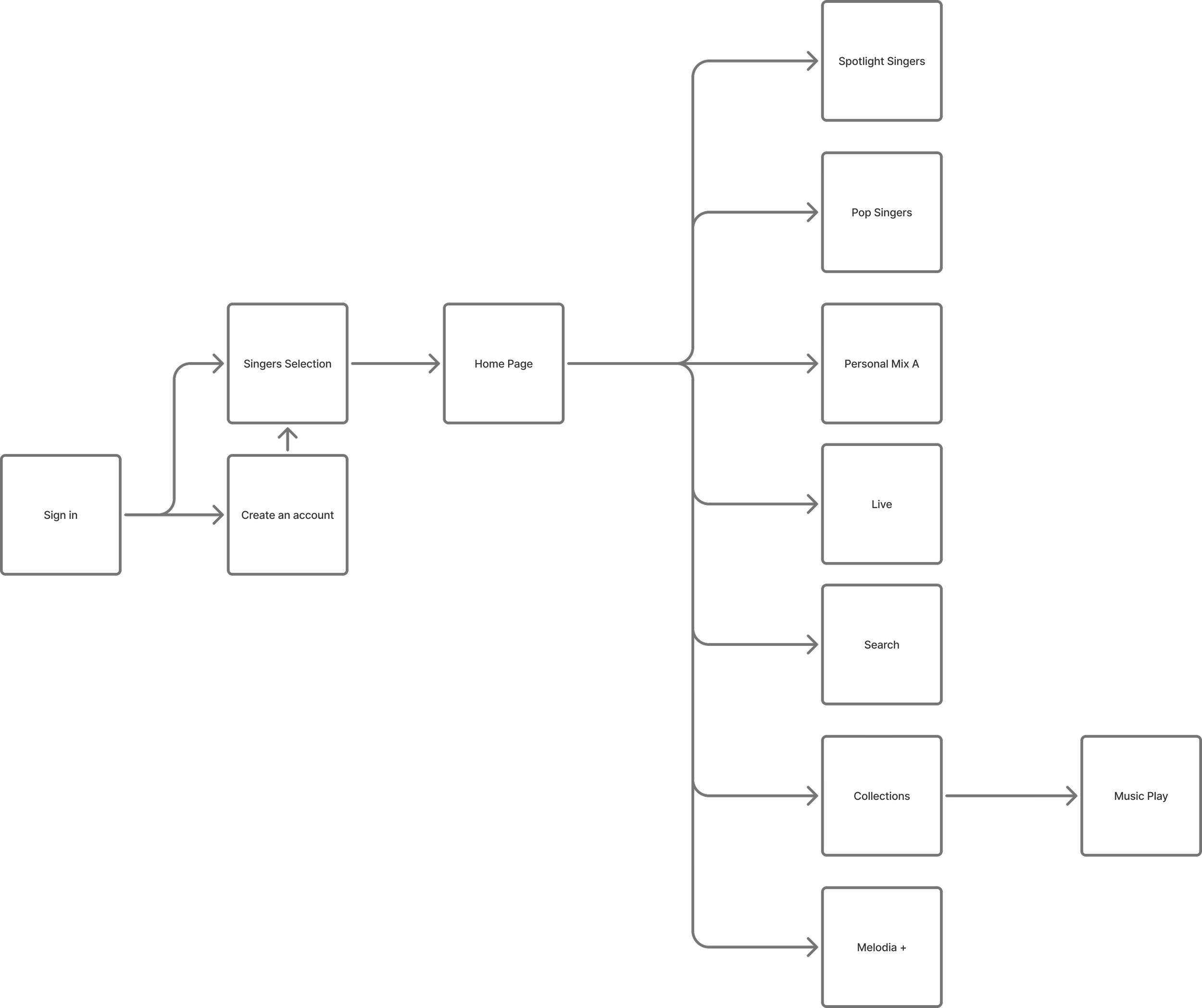
Information Architecture & App Structure
The information architecture of Melodia was designed to support a smooth and intuitive music listening experience. Because modern music platforms often present large and complex libraries, the structure focuses on simplifying discovery while allowing users to easily navigate between exploring music, listening to songs, and managing personal collections.
Rather than organizing the interface around technical music categories or dense menus, the architecture prioritizes clarity, discovery, and personal connection with music.
The primary navigation is structured around four core sections:
Discover
Library
Player
Profile
Each section represents a different listening intention and supports a natural flow between discovering music and revisiting personal favorites.
1. Discover — Music Exploration
The Discover section serves as the main entry point for exploring new music. Instead of presenting overwhelming lists of tracks, this area focuses on curated and mood-based discovery.
Users can explore:
Curated playlists
Mood-based music categories
Featured artists and albums
Personalized recommendations
This approach helps users find music in a way that feels intuitive and inspiring rather than overwhelming.
2. Library — Personal Music Collection
The Library module allows users to organize and revisit songs that are meaningful to them.
This section includes:
Saved songs
Favorite artists and albums
Personal playlists
Listening history
By structuring the library around personal collections, Melodia supports the idea that music is closely connected to individual experiences and memories.
3. Player — Seamless Listening Experience
The Player module is the core listening interface where users interact with the music itself.
Key features include:
Playback controls
Album artwork display
Queue management
Song information and quick actions
The design prioritizes clarity and minimal interaction friction so that users can focus on the listening experience.
4. Profile — Personal Preferences
The Profile section allows users to manage their listening preferences and personalize their experience.
This module includes:
Account settings
Listening preferences
Notification settings
Recommendation adjustments
Providing user control ensures that the app adapts to individual listening habits.
Structural Design Principles
The architecture of Melodia is guided by three key principles:
Clarity
Each section has a clear purpose, reducing navigation complexity.
Discovery
Music exploration is designed to feel intuitive and inspiring rather than overwhelming.
Personal Connection
The structure supports collecting and revisiting music that resonates with personal memories and emotions.
Architectural Outcome
By organizing the app around the natural flow of discovering, listening to, and collecting music, Melodia creates a structure that feels both intuitive and personal.
This architecture allows users to move effortlessly between exploring new music and revisiting meaningful songs, supporting a listening experience where music becomes part of everyday moments and memories.
Design Strategy
To address the challenges identified in the problem analysis, the design of Melodia focuses on creating a music listening experience that feels intuitive, emotionally engaging, and personally meaningful. The strategy emphasizes seamless discovery, memory-driven interaction, and a fluid listening flow that allows users to move naturally between exploring music, listening to songs, and organizing personal collections.
Rather than presenting music as a static library of tracks, the design reimagines music streaming as a dynamic experience where songs connect with moods, memories, and everyday moments.
1. Intuitive Music Discovery
With millions of available tracks, discovery can often feel overwhelming. Melodia simplifies this process by organizing music through curated playlists, mood-based exploration, and clear visual categories.
This approach allows users to discover songs naturally, without needing to navigate complex menus or search through large libraries. The goal is to make exploration feel effortless and inspiring rather than overwhelming.
2. Music as Personal Memory
Music often carries emotional memories and personal associations. The design therefore encourages users to collect, revisit, and rediscover songs that resonate with their experiences.
Features such as favorites, listening history, and personal collections allow users to organize music in ways that reflect their emotional connections rather than simply storing songs in static playlists.
This strategy aligns with the idea that music listening is not only about sound, but also about memory and personal meaning.
3. Seamless Listening Flow
Listening to music should feel continuous and uninterrupted. Melodia prioritizes smooth transitions between discovering music, playing songs, and managing personal collections.
The interface is designed with clear navigation, minimal friction, and consistent interaction patterns so that users can focus on the listening experience rather than navigating complex interfaces.
4. Emotionally Engaging Visual Design
Because music listening is closely tied to mood and atmosphere, the visual design aims to support an expressive and immersive environment.
The interface combines refined typography, balanced colors, and smooth transitions to create a calm yet engaging visual identity. These design choices reinforce the emotional tone of music while maintaining clarity and usability.
Strategic Outcome
Together, these strategies create a music experience that feels fluid, personal, and emotionally resonant. By emphasizing discovery, memory, and intuitive listening, Melodia transforms music streaming from simple content access into a more meaningful and immersive interaction with sound.
User Flow
The user flows in Melodia were designed to support a smooth and immersive music listening experience. Because modern music platforms often present vast libraries of content, the interaction flows prioritize clarity, intuitive discovery, and uninterrupted listening.
Rather than forcing users through complex navigation paths, the system allows listeners to move naturally between discovering new music, playing songs, and organizing their personal collections. Each flow corresponds to a different stage of the listening experience.
1. Discovery Flow — Exploring New Music
Intent: Find new songs through curated and mood-based exploration.
Flow:
Home → Discover → Browse Curated Playlists / Mood Categories → Select Song → Start Listening
The discovery flow introduces users to new music through visually organized playlists, featured albums, and mood-based categories. Instead of overwhelming users with large lists of songs, the interface highlights curated selections that encourage exploration.
This flow allows users to quickly move from discovery to listening while maintaining a sense of curiosity and engagement.
2. Listening Flow — Playing and Experiencing Music
Intent: Enjoy a seamless and uninterrupted listening experience.
Flow:
Home / Discover → Select Song → Open Player → Play / Pause / Skip → Continue Listening
The listening flow centers around the music player, where users can interact with playback controls while remaining immersed in the listening experience.
The interface prioritizes clarity and minimal interaction friction so that users can focus on the music rather than navigating complex controls.
3. Collection Flow — Saving Meaningful Songs
Intent: Save and organize songs that resonate with personal taste and memory.
Flow:
Discover / Player → Save Song → Add to Library / Playlist → Access in Library
This flow allows users to collect songs that feel meaningful to them. By saving favorites or creating playlists, listeners can build personal collections that reflect their musical preferences and experiences.
These collections make it easy to revisit songs connected to particular moods, moments, or memories.
4. Library Flow — Revisiting Personal Music
Intent: Return to saved songs, playlists, and listening history.
Flow:
Home → Library → Browse Saved Songs / Playlists → Select Song → Start Listening
The library flow supports rediscovery. Users can easily return to previously saved music and revisit songs that are meaningful to them.
This reinforces the idea that music listening is often connected to personal memory and emotional experience.
Flow Design Principles
Several design principles guided the structure of the user flows:
Clarity
Each flow has a simple and clearly defined path, minimizing unnecessary navigation steps.
Continuous Listening
The interaction design ensures that users can move between discovery and playback without interrupting the listening experience.
Personal Connection
Flows support saving and revisiting music, reflecting the strong relationship between music, memory, and emotion.
Seamless Interaction
Navigation remains intuitive so users can explore music naturally without feeling overwhelmed by large content libraries.
Flow Outcome
The resulting user flow system creates a listening experience that feels fluid and intuitive. By supporting effortless discovery, smooth playback, and meaningful personal collections, Melodia allows users to move naturally between exploring new music and revisiting songs connected to their memories and emotions.
Wireframes
The wireframing phase translated Melodia’s design strategy and user flows into clear screen structures. At this stage, the focus was on defining layout hierarchy, interaction logic, and content organisation before introducing visual styling.
The process progressed through two stages: low-fidelity exploration followed by mid-fidelity refinement. This iterative approach allowed the core learning journey to be validated and simplified before moving into the final visual design.
Low-Fidelity Wireframes
Low-fidelity wireframes were created to quickly explore layout possibilities and test the fundamental structure of the learning experience. These early sketches focused purely on functionality and user flow rather than visual details.
Key screens explored during this phase included:
Home Dashboard
Lesson Selection
Practice Interface
Progress Tracking
User Profile
The Home Dashboard was designed as the central hub of the app. It provides quick access to current lessons, practice exercises, and progress updates. The layout prioritises immediate visibility of the user’s next learning step, ensuring that learners can begin practicing without navigating through complex menus.
The Lesson Selection screen introduces a clear progression system. Lessons are organised by levels and skill categories, allowing users to easily understand their learning path and select the next activity.
The Practice Interface focuses on simplicity and concentration. During early exploration, multiple layout options were tested to determine the most effective way to present musical exercises while keeping interaction controls accessible.
The Progress Tracking screen was designed to visually summarise achievements, completed lessons, and learning milestones. This layout reinforces motivation by making progress visible and easy to understand.
Because low-fidelity wireframes remove visual distractions, they helped validate the clarity of navigation and ensure that users could complete core tasks with minimal steps.

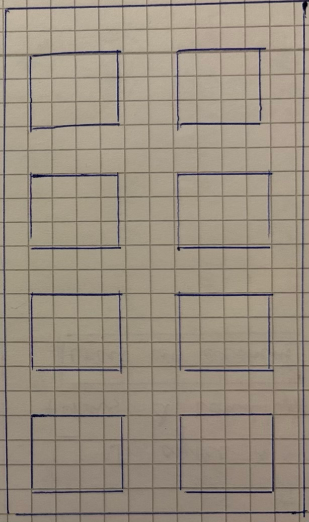

Mid-Fidelity Wireframes
Once the core layout and navigation patterns were established, the design progressed to mid-fidelity wireframes. At this stage, the interface incorporated clearer typographic hierarchy, refined spacing, and more defined UI components while still remaining visually neutral.
Mid-fidelity wireframes allowed the design to test:
Information hierarchy within music discovery screens
Placement of playback controls and song metadata
Interaction patterns for saving songs and creating playlists
Consistency across navigation and browsing structures
These refinements helped ensure that the experience remained intuitive while supporting the primary user goals of discovering, listening to, and organizing music.
Discover Screen
The Discover screen was refined to present curated music content in a structured and visually scannable layout. Playlists, albums, and recommendations were organized into card-based sections that allow users to quickly browse and select music.
Typography hierarchy and spacing were adjusted to ensure that song titles, artist names, and playlist categories remain easy to read without overwhelming the interface.
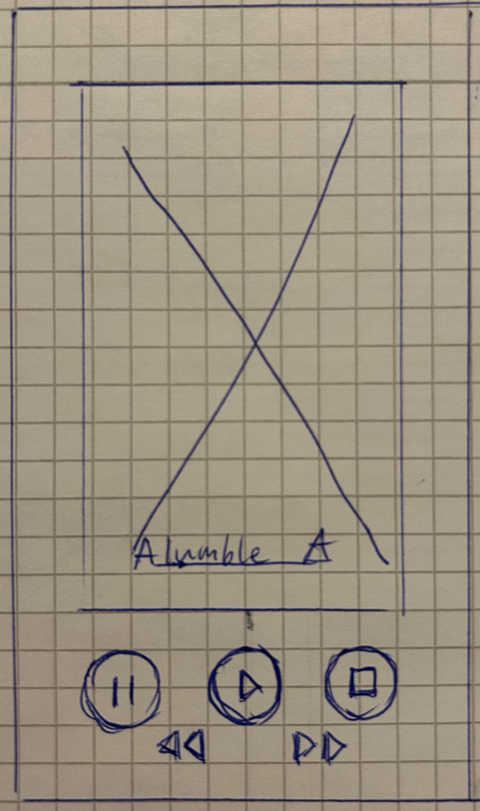
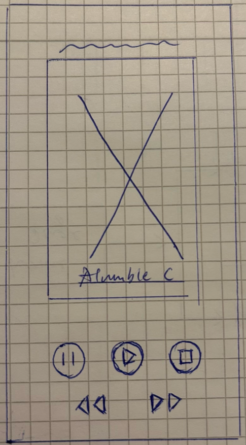
Music Player Interface
The Music Player evolved into a more focused listening environment. The mid-fidelity design clarified the placement of key elements such as album artwork, playback controls, song information, and queue management.
Interaction elements such as play, pause, skip, and save were positioned within comfortable thumb reach to support seamless interaction during playback.
This layout prioritizes simplicity so users can remain immersed in the listening experience.
Library & Playlist Management
The Library screen was refined to support easy browsing of saved songs, playlists, and favorite artists. Clear section divisions help users quickly locate music they have previously saved.
The playlist management flow was also tested during this stage, ensuring that users could easily add songs to playlists or organize their music collections with minimal steps.
Structural Consistency
Throughout the mid-fidelity stage, particular attention was given to maintaining consistency across navigation patterns and screen layouts. Standardized spacing, card structures, and interaction patterns were introduced to ensure a coherent experience across all sections of the app.
Mid-Fidelity Outcome
By the end of the mid-fidelity stage, the structural foundation of Melodia was clearly defined. The design successfully balanced music discovery, seamless playback, and personal collection management within a unified interface system.
This stage confirmed that users could move smoothly between discovering new music, listening to songs, and organizing their personal libraries before progressing to the final visual design.


Color Strategy
The color strategy for Melodia was designed to create a visually immersive music environment that balances elegance, clarity, and emotional atmosphere. Because music is closely connected to mood and memory, the palette aims to evoke a sense of depth and refinement while maintaining strong readability across the interface.
The visual identity of the app is built around a luxurious black-and-gold palette, where deep black backgrounds highlight refined golden accents. This contrast creates a cinematic listening environment that draws attention to album artwork, typography, and interactive elements while reinforcing Melodia’s premium character.
The primary palette includes:
Deep Black — #050101
Gold Accent — #CDA052
Soft Light Grey — #DCD6D6
Warm Bronze — #A06909
The dark background provides strong contrast for text and interface elements, while the gold accents introduce warmth and sophistication reminiscent of classic music instruments and stage lighting.
1. Premium Visual Identity
The black-and-gold foundation establishes Melodia’s distinctive visual identity. The deep black interface creates an immersive backdrop that allows music content—such as album artwork and artist imagery—to stand out clearly.
Gold accents are used selectively to highlight key interactions including:
Primary action buttons
Active playback indicators
Navigation highlights
Interactive controls
This restrained use of gold reinforces the premium aesthetic while ensuring that the interface remains visually balanced.
2. Supporting Neutral Colors
To maintain readability and visual balance, a set of neutral tones supports the primary palette.
These include:
Soft Grey — #DCD6D6
Warm Neutral — #C1B6A1
White — #FFFFFF
These colors provide visual breathing space within the interface, ensuring that song titles, artist names, and navigation elements remain clear against the dark background.
3. Functional Accent Colors
Additional accent colors are introduced sparingly to support interaction feedback and content categorization.
These include:
Vibrant Purple — #6752CD
Warm Red — #BF282A
Cool Blue — #529ACD
These tones help differentiate playlists, highlight active states, or provide subtle interaction feedback while maintaining harmony with the overall palette.
4. Color as Atmosphere
Beyond functional clarity, color in Melodia also contributes to the emotional tone of the listening experience. The dark interface creates a focused and intimate environment, similar to the atmosphere of a concert hall or late-night listening session.
By combining deep blacks with warm metallic accents, the design encourages users to remain immersed in music while allowing visual elements to remain calm and uncluttered.
Color Outcome
The final color system creates a refined and immersive environment that reflects the emotional depth of music while maintaining clarity across the interface.
The luxurious black-and-gold palette establishes Melodia’s premium visual identity, while supporting neutral and accent tones ensure usability and visual balance.
Together, the color strategy transforms Melodia into an elegant digital space where music discovery and listening feel both immersive and personal.
Wireframe Outcome
The wireframing process confirmed that Melodia’s music discovery and listening experience could be presented through a clear and intuitive interaction flow. By validating layout decisions early in the design process, the structure ensured that users could easily move between exploring new music, playing songs, and saving favorites to their personal library.
This stage helped refine the hierarchy of key screens—including Discover, Player, and Library—while minimizing navigation complexity and interaction friction.
The wireframes established the structural foundation of the app, which would later be enhanced through colour, typography, and visual styling during the final UI design phase.

Typographic Hierarchy
Because Melodia presents multiple layers of music content—from playlists and albums to individual tracks—a clear typographic hierarchy is essential for guiding user attention.
The hierarchy is structured as follows:
H1 — Primary Titles
Used for major headings such as playlist titles and featured music sections.
These titles use the display typeface and create a strong visual anchor within the interface.
H2 — Section Headers
Used for categories such as Discover, Library, or curated playlists.
These elements help organize content into clearly structured areas.
Song Titles — Primary Content
Song titles are designed to be highly readable and visually prominent, allowing users to quickly identify tracks within lists and playlists.
Metadata — Artist Names, Album Info
Artist names and album details are presented in a lighter visual weight to support quick scanning without distracting from the main content.
UI Labels — Navigation & Controls
Navigation labels and system controls use compact typography optimized for clarity and quick recognition.
This layered hierarchy ensures that users can easily browse music collections and identify important information at a glance.
Readability in Dark Interface Environments
Because Melodia’s interface uses a dark visual theme, careful attention was given to contrast and spacing. Typography is rendered in light tones against deep black backgrounds to maximize legibility while maintaining visual comfort during extended listening sessions.
Key considerations include:
Balanced contrast between headings and body text
Comfortable line spacing for song lists
Controlled text width for readability
Clear distinction between song titles and metadata
These adjustments ensure that the interface remains clear even when browsing large music libraries.
Emotional Tone
The typographic system reflects the expressive nature of music itself. Elegant headings evoke the atmosphere of live performance and musical artistry, while clean body text introduces clarity and structure.
This balance mirrors Melodia’s overall design philosophy: creating a listening experience that feels both refined and effortless.
Typography Outcome
The final typography system strengthens both the visual identity and functional usability of the app. By pairing expressive display headings with highly readable interface text, Melodia maintains a premium aesthetic while ensuring that music browsing and playback interactions remain intuitive.
Typography therefore becomes not only a visual element but also a structural guide that helps users navigate and experience music naturally.
Layout & Grid
The layout system of Melodia was designed to create a structured yet immersive listening environment. Because the app presents large amounts of music content—such as playlists, albums, and song collections—the interface needed to balance visual elegance with clear information hierarchy.
The layout emphasizes rhythm, spacing, and alignment, reflecting the flow and structure of music itself. Through a disciplined grid system, the interface allows users to move smoothly between discovering music, playing songs, and managing personal collections without visual clutter.
1.Structural Grid Foundation
Melodia’s interface is built on a modular grid system that ensures consistency across screens and device sizes.
Key structural principles include:
Consistent horizontal margins
Predictable vertical spacing intervals
Aligned content modules
Responsive layout behaviour across screen sizes
This grid structure allows music content—such as playlists, albums, and song lists—to remain visually stable and balanced while supporting flexible placement of interface components.
The modular system also supports scalability, allowing additional music collections, playlists, or recommendation sections to be integrated without disrupting the overall layout.
2.Card-Based Content Structure
Because Melodia presents multiple types of music content, the interface uses a card-based layout to organize information clearly.
Cards are used to present:
Playlists
Albums
Artist highlights
Recommended tracks
Each card maintains consistent proportions and spacing, ensuring predictable interaction patterns across the app. This structure allows users to quickly scan music selections and identify content they want to explore.
Album artwork and cover images are given visual prominence within these cards, reinforcing the emotional and visual identity of the music.
3.Generous Use of Space
Spacing plays an important role in maintaining clarity and visual comfort. Rather than compressing large lists of songs into dense layouts, the design introduces breathing space between elements.
This approach helps to:
Improve readability of song titles and artist names
Support comfortable browsing through playlists
Highlight key interactive elements such as playback controls
The controlled use of spacing also enhances the premium visual identity established by the dark interface and gold accents.
4.Hierarchy Through Layout
Visual hierarchy is reinforced primarily through layout structure rather than heavy visual decoration. Key elements such as playlist titles, album artwork, and playback controls are positioned strategically to guide user attention.
Primary content—such as featured playlists or currently playing tracks—appears in prominent central areas, while supporting information is placed within secondary modules. This layered structure allows users to quickly understand each screen’s purpose and navigate naturally through the interface.
5.Responsive Adaptation
The grid system adapts fluidly across different screen sizes while maintaining the visual rhythm of the interface.
Key layout elements—such as playlist cards, album covers, and playback controls—retain consistent proportions and alignment across devices. This ensures that the listening experience remains stable and intuitive regardless of screen dimensions.
Layout Outcome
The final layout and grid system establishes a clear visual rhythm that supports Melodia’s music discovery and listening experience. By combining modular structure, balanced spacing, and disciplined hierarchy, the interface remains visually refined while allowing users to explore and interact with music effortlessly.
This structured foundation helps Melodia maintain its premium visual identity while ensuring that music content remains the central focus of the interface.
Iconography
Iconography in Melodia was designed to support intuitive navigation while reinforcing the app’s refined visual identity. Because the platform focuses on music discovery and listening, the icon system needed to balance clarity, simplicity, and visual elegance.
Rather than relying on decorative graphics, the iconography emphasizes clean, recognisable symbols that guide interaction and communicate meaning instantly.
1.Minimal and Recognisable Forms
The icon set uses simple geometric shapes and minimal visual detail to ensure immediate recognisability. Each icon communicates its function clearly without requiring additional explanation.
Common interface actions such as:
Play / Pause music
Skip tracks
Save songs
Add to playlists
Search music
Access profile settings
are represented through familiar symbols that users can easily recognise across different screens.
This simplicity reduces cognitive load and allows users to focus on discovering and enjoying music rather than interpreting interface elements.
2.Visual Consistency
All icons follow a consistent design language based on:
Uniform line weight
Rounded geometric forms
Balanced spacing within icon frames
Maintaining consistent proportions ensures that icons remain visually harmonious across the interface. This consistency supports the layout system and contributes to the app’s polished and professional appearance.
3.Integration with the Color System
Icons are primarily displayed in light neutral tones or white against the dark interface to ensure strong contrast and visibility. For active or highlighted states, the gold accent color (#CDA052) is applied to reinforce interaction feedback.
For example:
Active navigation icons appear in gold
Playback controls highlight when selected
Saved or liked songs are visually emphasised
This subtle use of color helps users quickly recognise interactive elements while preserving the elegant atmosphere of the interface.
4.Supporting Music Interaction
Icons also play an important role in guiding the listening experience. Clear visual symbols help users understand different actions within the music interface and navigate the app effortlessly.
Examples include icons representing:
Music playback controls
Playlist management
Song saving and favorites
Music discovery and search
Library and personal collections
These icons provide quick orientation within the interface, allowing users to interact with music naturally and confidently.
Iconography Outcome
The final icon system strengthens both usability and visual identity. Through minimal forms, consistent structure, and subtle integration with the gold-accent color palette, the iconography supports navigation without competing with the music content.
By guiding interaction clearly and maintaining visual elegance, the icon system contributes to Melodia’s goal of creating a refined and immersive environment for discovering and enjoying music.
Imagery & Illustration
Imagery in Melodia plays an important role in shaping the emotional atmosphere of the listening experience. Because music is closely connected to mood, memory, and personal identity, the visual language was designed to complement the expressive nature of music while maintaining the app’s refined aesthetic.
Rather than relying heavily on decorative illustrations, the design emphasizes album artwork, artist imagery, and subtle visual accents that enrich the interface without distracting from the listening experience.
Music-Centered Visual Language
The primary visual elements within Melodia are album covers, artist images, and playlist artwork. These visuals naturally represent the identity of each piece of music while creating a visually engaging browsing experience.
Album artwork functions as the central visual anchor throughout the app. It appears prominently in several areas, including:
Discover playlists
Featured albums
Song cards
The music player interface
By allowing album artwork to remain visually dominant, the interface ensures that music content becomes the focal point of the experience.
Mood and Atmosphere
Because music listening is strongly connected to emotion and memory, imagery also supports the atmosphere of the interface. Curated playlists and discovery sections often incorporate subtle visual themes that reflect musical moods or genres.
For example:
Soft gradients and abstract backgrounds suggest ambient or atmospheric music
Darker imagery supports late-night listening environments
Warm tones may accompany energetic or upbeat playlists
These visual cues help users intuitively associate music with particular moods and listening contexts.
Balanced Integration with the Interface
Melodia’s dark interface allows imagery to stand out without overwhelming the layout. Visual elements are carefully integrated into the structure of the interface through card-based layouts and balanced spacing.
Key visual considerations include:
Clear framing of album artwork within cards
Consistent proportions across playlist and album visuals
Controlled contrast against the dark background
This approach maintains the premium aesthetic established by the black-and-gold visual system while ensuring that imagery remains harmonious with typography and layout.
Subtle Illustrative Elements
While album artwork serves as the primary visual element, subtle graphic accents are occasionally used to enhance the interface. These may include:
Abstract sound wave motifs
Minimal geometric shapes inspired by music rhythm
Soft visual transitions between sections
These elements add visual depth while remaining understated, ensuring that the music content remains the central focus.
Imagery Outcome
The final imagery system creates a visually rich yet balanced environment that reflects the emotional depth of music. By allowing album artwork and artist visuals to take prominence, the interface celebrates the visual identity of music itself.
Combined with the dark, elegant interface and refined color palette, the imagery contributes to an immersive listening experience where music discovery feels both personal and atmospheric.
Final UI Screens
The final UI of Melodia brings together the app’s discovery strategy, interaction flows, and visual system into a cohesive and immersive listening experience. Each screen was designed to support effortless music exploration while maintaining a refined and atmospheric interface.
The design combines the luxurious black-and-gold visual identity with clear layout hierarchy and intuitive interaction patterns. This balance ensures that the interface feels visually distinctive while allowing music content—such as album artwork and playlists—to remain the central focus.
1. Discover
The Discover screen acts as the primary entry point for exploring music. It introduces curated playlists, featured albums, and mood-based recommendations that help users navigate a large music library in an intuitive way.
Key elements include:
Featured playlists and albums
Mood-based music categories
Personalized recommendations
Visually prominent album artwork
The layout prioritizes visual scanning and quick exploration, allowing users to move naturally from browsing to listening. The dark interface enhances the visual impact of album artwork while maintaining a calm and immersive atmosphere.
2. Music Player
The Music Player screen provides a focused listening environment where users interact directly with the music.
Important elements include:
Large album artwork display
Playback controls (play, pause, skip)
Song title and artist information
Save and playlist actions
The interface emphasizes clarity and simplicity, ensuring that essential controls remain accessible while keeping visual distractions to a minimum. The combination of dark backgrounds and subtle gold accents reinforces the premium aesthetic while maintaining focus on the music itself.
3. Library
The Library screen allows users to access and organize their personal music collections. This section provides quick access to saved songs, playlists, and favorite artists.
Users can easily browse:
Saved songs
Personal playlists
Favorite albums and artists
Listening history
The structured layout helps users quickly locate previously discovered music, reinforcing the idea that music collections often reflect personal taste and memory.
4. Playlist Management
Playlists allow users to curate their own listening experiences. The Playlist interface enables users to create and organize collections of songs based on mood, genre, or personal preference.
Key features include:
Playlist creation and editing
Adding songs directly from the player or discovery screens
Visual playlist artwork
Easy song reordering and organization
This feature encourages users to build meaningful music collections that can be revisited over time.
5. Profile & Personalization
The Profile screen provides access to account settings and personalization features that adapt the listening experience to each user’s preferences.
Users can manage:
Account information
Listening preferences
Notification settings
Recommendation adjustments
Providing these customization options ensures that Melodia can adapt to individual listening habits and music tastes.
Final Interface Outcome
The final interface successfully integrates music discovery, seamless playback, and personal music collections within a refined visual environment. Through clear navigation, balanced layouts, and the distinctive black-and-gold aesthetic, Melodia creates a listening experience that feels both elegant and intuitive.
By combining immersive visuals with simple interaction patterns, the design encourages users to explore new music while easily revisiting songs that resonate with their personal memories and emotions.

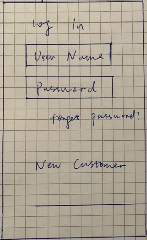
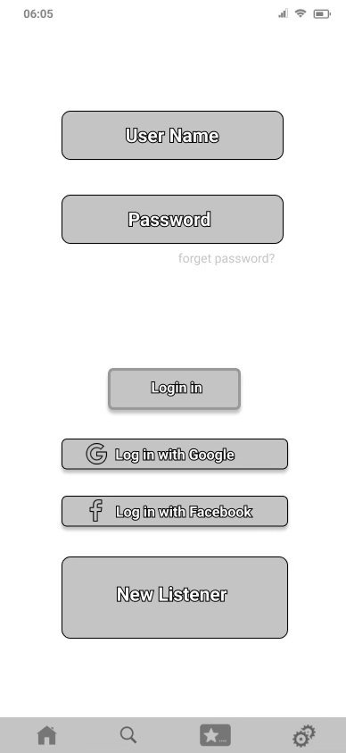
Sign in
The Melodia sign-in page exudes a luxurious black-and-gold aesthetic, designed to capture the elegance of music. At its center, the Melodia symbol logo gleams in radiant gold, surrounded by a cascade of floating musical notes that bring the interface to life. Behind the logo, a textured backdrop evokes the grandeur of a pipe organ, adding depth and sophistication to the scene. The sign-in button, matching the logo’s gold tone, stands out boldly against the sleek black background, creating a harmonious and visually striking composition that feels both modern and timeless.
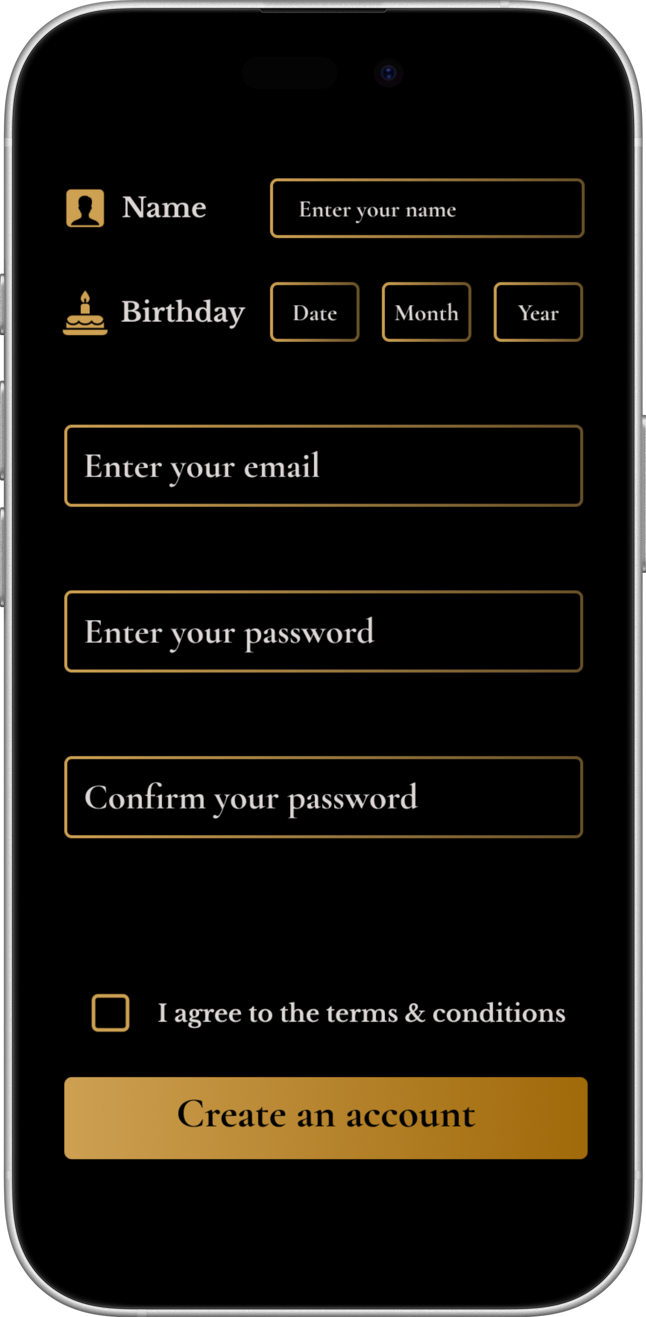
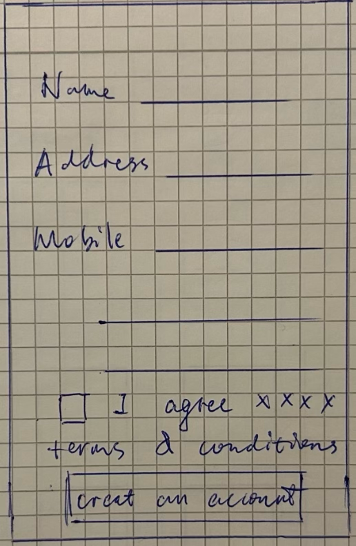
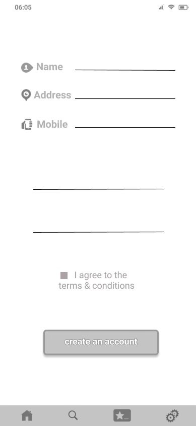
Create an account
The Create an Account page of Melodia combines elegance and usability, designed in a striking black-and-gold theme. Users can smoothly enter their name, birthday, email, and password into sleek input fields framed with golden outlines, while matching golden icons beside the name and birthday fields add a refined touch. A visually dynamic golden button bar shifts in tone when tapped, providing tactile feedback and guiding users effortlessly through the sign-up process. The luxurious color palette and minimalist layout echo Melodia’s identity, making onboarding feel premium and intuitive.
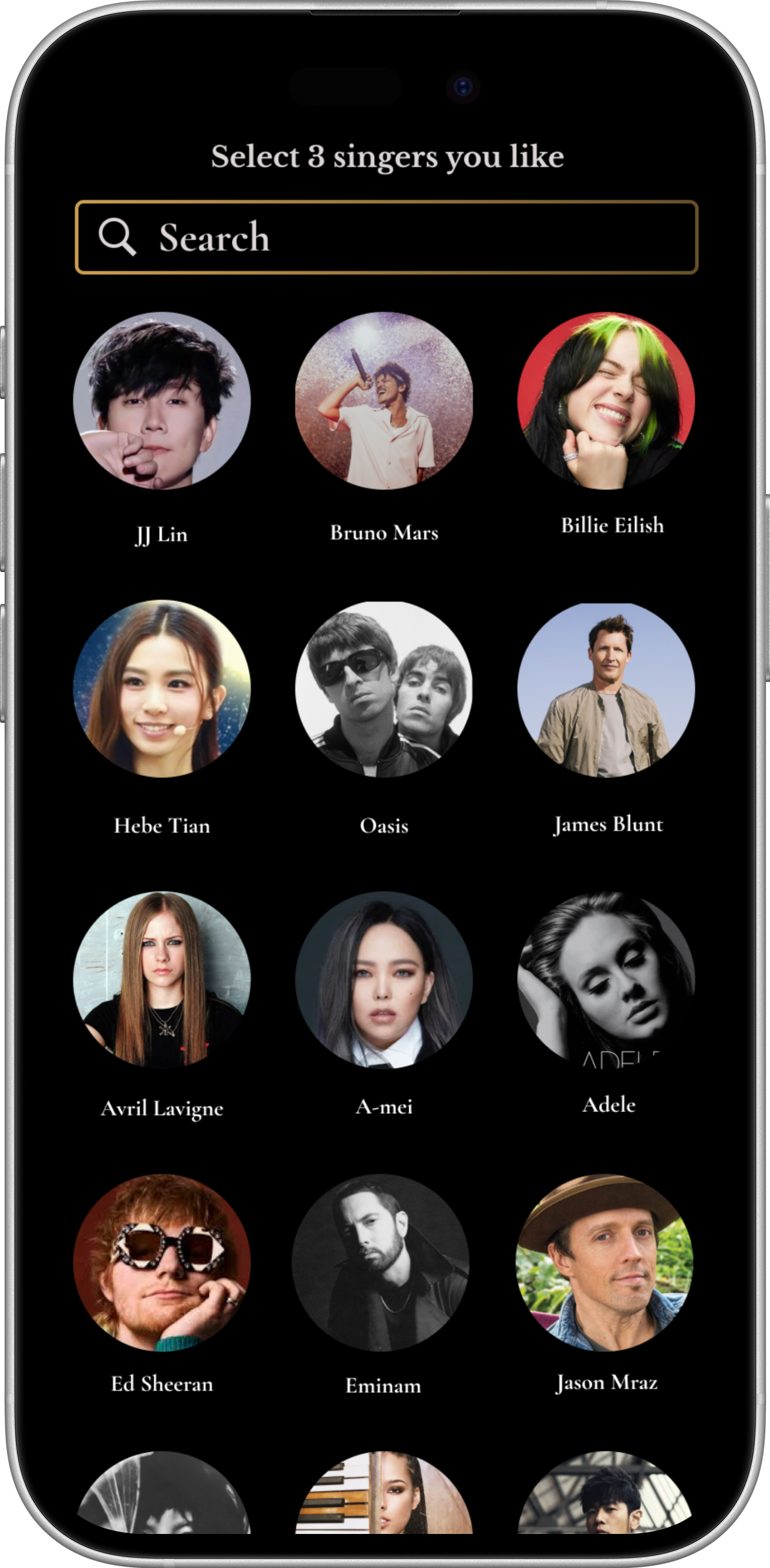
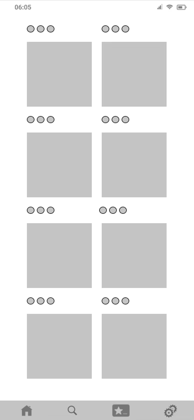
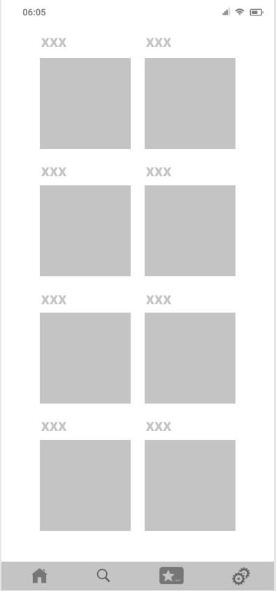
Signer Selection
The Singer Selection page invites users into a world of music discovery, showcasing a curated list of global singers in a visually rich, scrollable interface. After signing in, users are prompted to pick at least three favorite artists, highlighted with elegant gold accents against a sleek dark background. This personalized selection powers Melodia’s smart recommendation engine, instantly generating a custom music list tailored to each listener’s unique taste. With its stylish black-and-gold theme and intuitive multi-select interaction, the page makes personalization feel effortless and immersive.
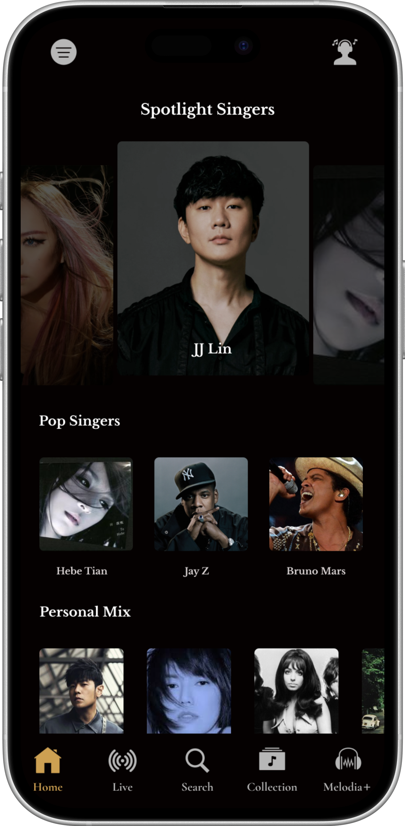
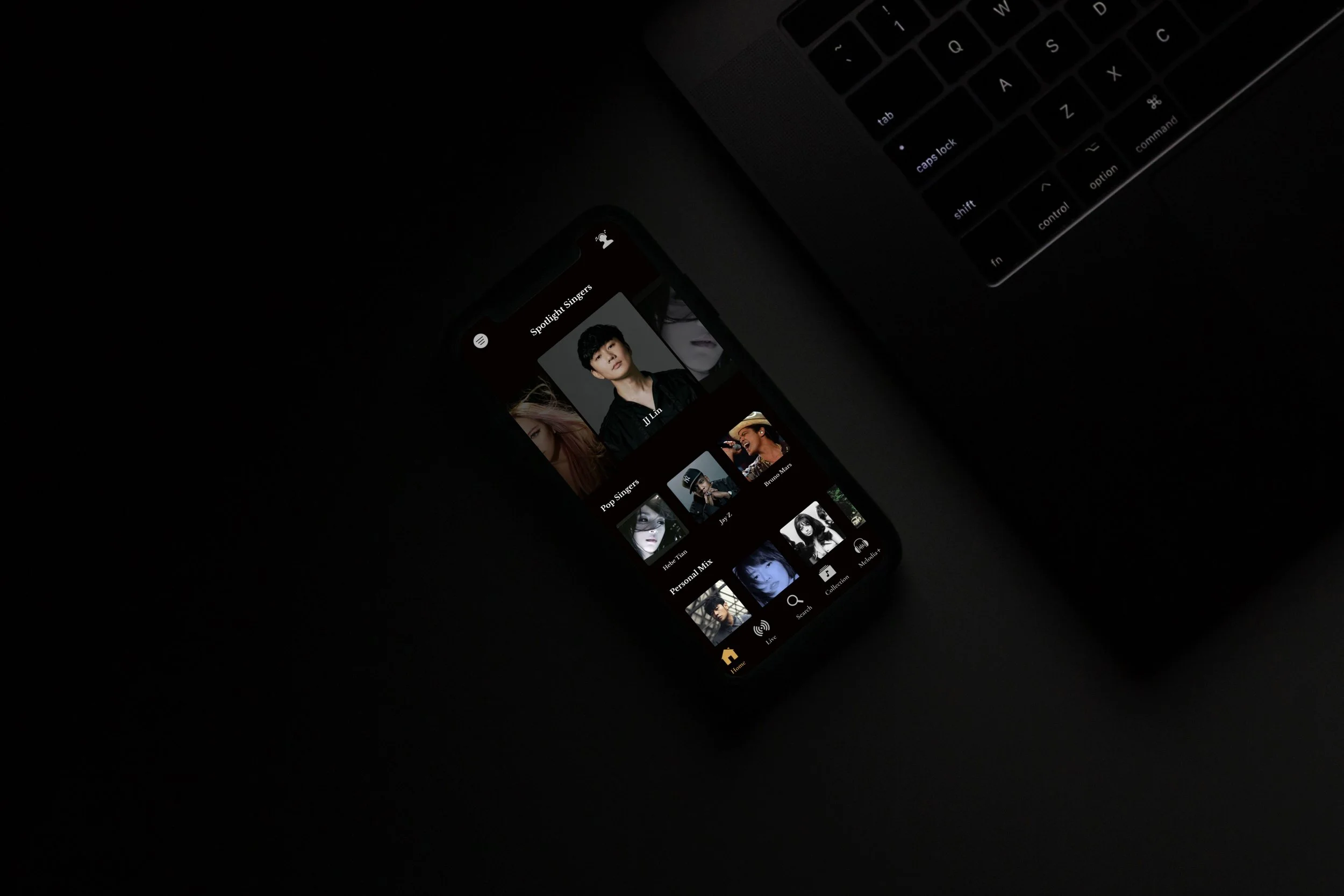
Home Page
The Melodia Home Page is designed to immerse users in a personalized music experience while maintaining the app’s luxurious black-and-gold aesthetic. At the top, a Spotlight Singers carousel showcases featured global artists on elegantly styled scrollable cards, drawing immediate attention. Below, curated sections like Pop Singers and Personal Mix present tailored recommendations in a sleek horizontal scroll layout, blending selected artists from the user’s chosen favorites. The structured, card-based design ensures easy navigation, while the golden highlights and smooth scrolling interactions add a sense of premium fluidity, making music discovery both intuitive and visually engaging.
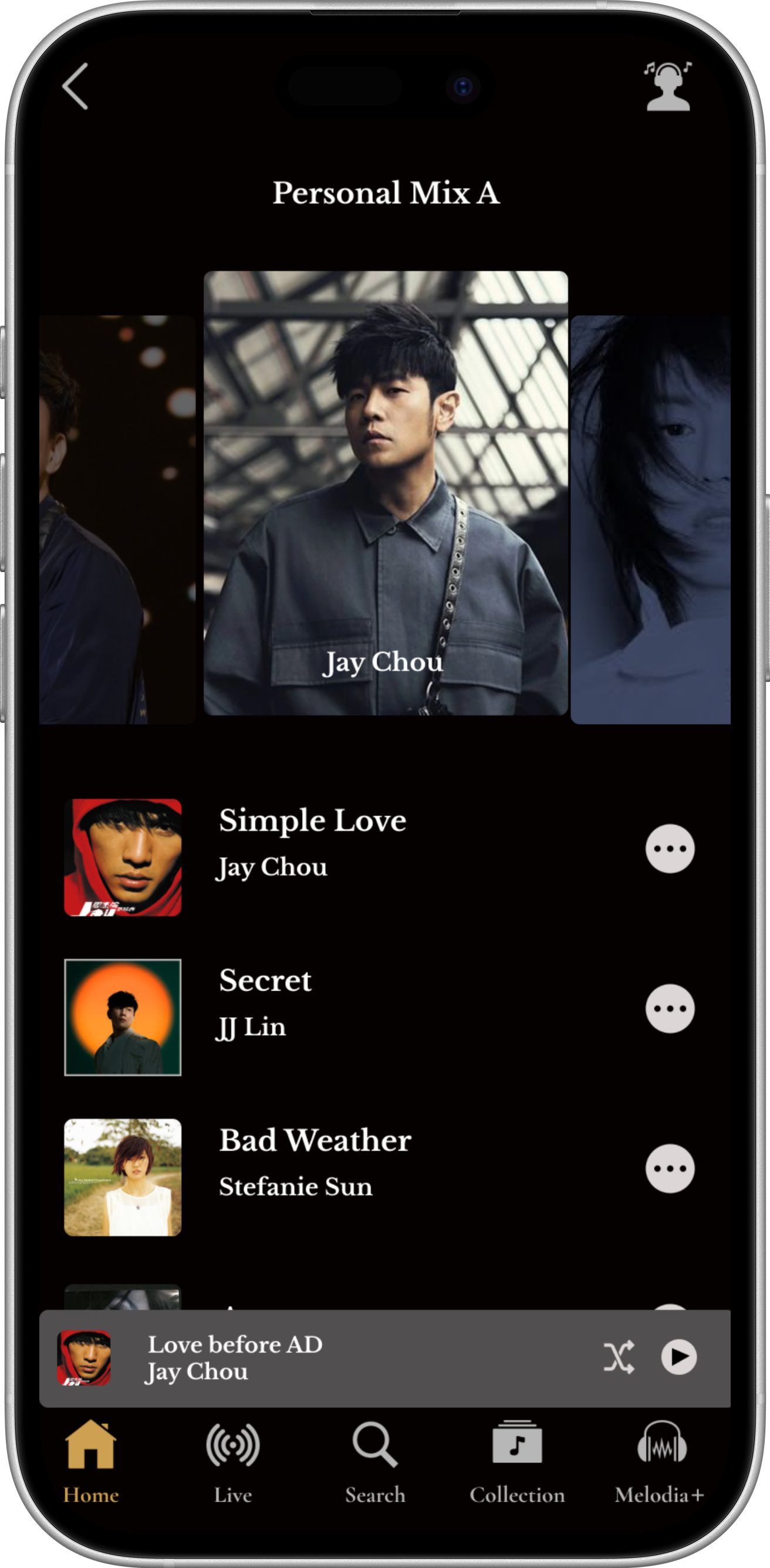
Personal Mix
The Personal Mix page in Melodia delivers a fully tailored listening experience, automatically generating a custom music list based on each user’s favorite singers. A sleek mini player sits at the bottom of the screen with intuitive Play and Shuffle buttons for effortless control. Users can tap the View More icon to access additional playback options and manage tracks within their mix list. Designed in Melodia’s signature black-and-gold theme, this page combines elegance with functionality, making personalized music playback simple and engaging.
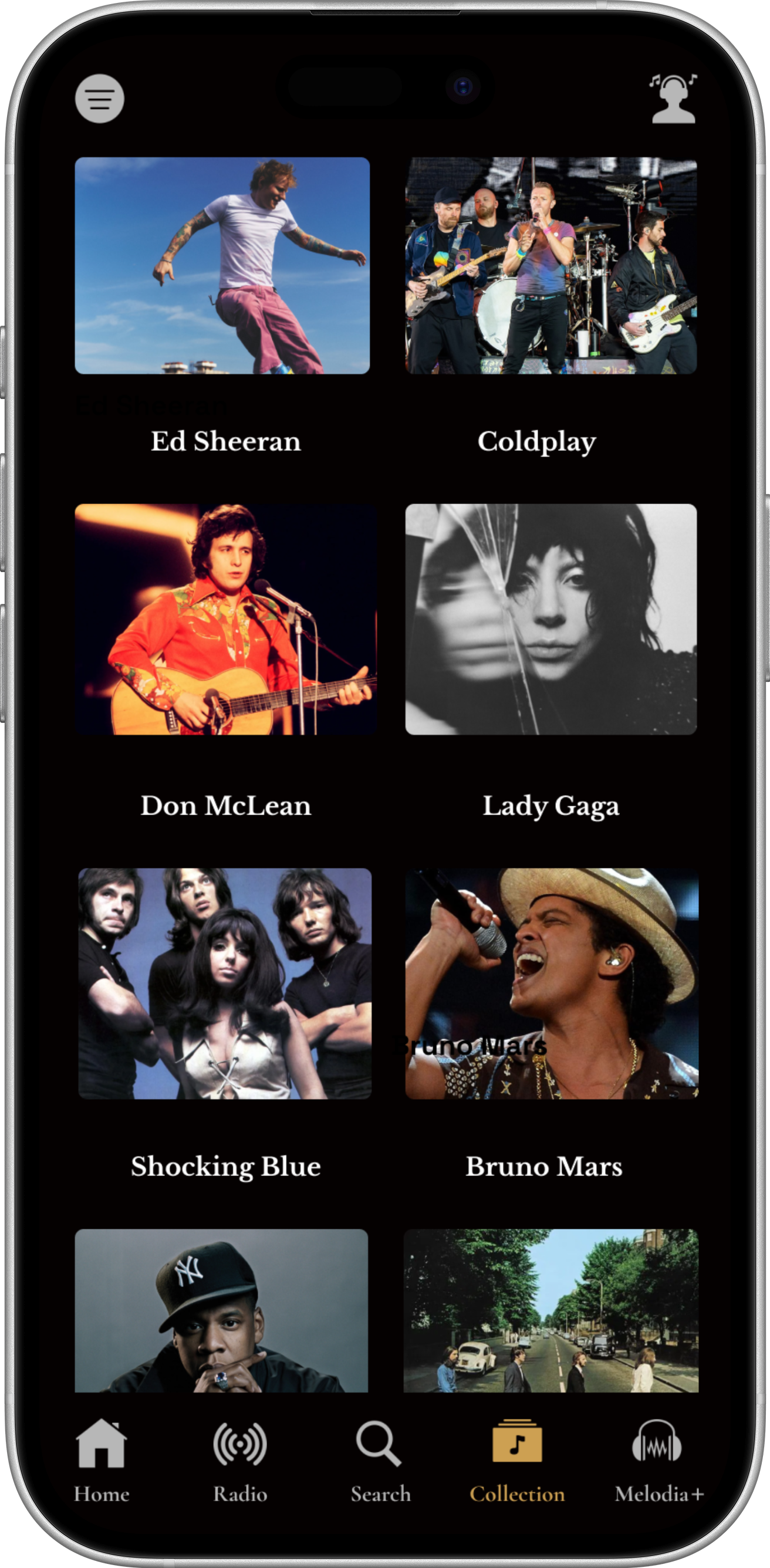
Collections
Music collections in Melodia are designed to capture moments, moods, and memories. Rather than simply organising songs, collections allow users to group music based on personal meaning — whether it’s a late-night playlist, a travel memory, or a favourite artist era. By bringing together discovery and nostalgia, Melodia transforms music collections into living spaces where listeners can revisit meaningful sounds and create new experiences over time.
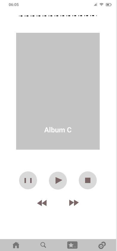
Music Play
The Music Play page offers a sleek and immersive listening interface, designed with Melodia’s signature black-and-gold aesthetic. At the center, a large playback control panel features intuitive Play, Forward, and Backward buttons for effortless navigation between tracks. A stylish golden progress bar visually represents the song’s timeline, allowing users to scrub through the track with precision. Complemented by clean typography and smooth animations, this page delivers a premium, user-friendly music experience while keeping essential playback controls always within reach.
Future Improvements
While Melodia establishes a strong foundation for a refined music discovery and listening experience, there are several opportunities to further enhance the platform through deeper personalization, intelligent recommendations, and richer social interaction. Future development would focus on strengthening long-term engagement while allowing users to build more meaningful relationships with the music they discover.
1. AI-Powered Music Recommendations
Currently, Melodia introduces music through curated playlists and mood-based discovery. Future iterations could incorporate AI-driven recommendation systems that adapt to individual listening behavior.
By analyzing listening history, saved tracks, and playlist interactions, the system could suggest music tailored to each user’s evolving preferences. These recommendations might include:
Personalized daily mixes
Mood-based suggestions
Artist discovery based on listening patterns
This approach would allow users to discover new music naturally while maintaining a sense of personal relevance.
2. Memory-Based Listening Experience
Music often carries strong emotional and personal associations. A future version of Melodia could introduce features that highlight these connections by organizing music around listening memories.
Possible features include:
“On This Day” listening history
Memory playlists generated from past listening habits
Timeline views of favorite songs over time
This feature would reinforce the emotional dimension of music listening, allowing users to revisit songs connected to specific moments or experiences.
3. Smart Playlist Generation
Playlist creation could be expanded through intelligent automation. Instead of manually building playlists, users could generate collections based on mood, genre, or listening context.
Examples might include:
Late-night listening playlists
Focus or relaxation music sets
Automatically updated favorite tracks
Smart playlists would simplify music organization while encouraging users to explore different listening environments.
4. Social Music Discovery
Music discovery often happens through social interaction. Future versions of Melodia could introduce optional social features that allow users to share and discover music through their networks.
Potential features include:
Sharing playlists with friends
Collaborative playlist creation
Discovering trending music among connections
These social interactions could create a sense of community while expanding opportunities for discovering new music.
5. Cross-Device Listening Experience
To support modern listening habits, Melodia could expand into a multi-device ecosystem. Future iterations might include seamless transitions between devices such as smartphones, tablets, and desktop platforms.
Users could begin listening on one device and continue on another without interrupting the playback experience.
Strategic Outlook
The long-term vision for Melodia is to evolve from a beautifully designed music player into a personalized music discovery companion. By combining intelligent recommendation systems, memory-based listening experiences, and social discovery features, the platform could support deeper emotional engagement with music.
Through these future developments, Melodia would continue to enhance how users explore, experience, and remember the music that shapes their lives.
Reflection
Designing Melodia required balancing two important aspects of digital music experiences: intuitive interaction and emotional atmosphere. While music platforms must provide efficient navigation and playback controls, they should also create an environment where users feel immersed in the music itself.
Throughout the project, the main challenge was ensuring that the interface remained simple and functional while still conveying the emotional richness associated with music listening.
Balancing Simplicity and Atmosphere
One of the central design considerations was how to create a visually distinctive interface without overwhelming the user. The black-and-gold visual system was introduced to evoke a refined and immersive listening environment, but it required careful control to maintain clarity and usability.
Through multiple iterations of layout and hierarchy, the design gradually evolved into a balanced system where visual atmosphere enhances the listening experience without distracting from navigation or playback interaction.
This process reinforced the importance of visual restraint in interface design, particularly in content-rich environments such as music platforms.
Designing for Discovery
Music platforms often contain large libraries of content, which can easily become overwhelming. A key design challenge was creating a discovery system that encourages exploration while keeping navigation intuitive.
By organizing content through curated playlists, mood-based categories, and structured browsing sections, the interface helps users move naturally between discovering new music and revisiting familiar songs.
This approach highlighted how information architecture plays a crucial role in shaping how users explore digital content.
Music, Memory, and Emotional Experience
Another important insight during the project was the close relationship between music and memory. Songs often carry personal associations, connecting listeners to specific moments or emotions.
This perspective influenced several design decisions, including the prominence of album artwork, the structure of personal music libraries, and the emphasis on building meaningful song collections.
Designing for music therefore became not only a technical challenge but also an exploration of how digital interfaces can support emotional and reflective experiences.
Key Takeaways
This project strengthened my understanding of how interface design can shape both functionality and emotional engagement. In music applications, visual identity, layout structure, and interaction design must work together to support a seamless listening experience.
The process also reinforced the importance of designing systems that remain visually calm and intuitive even when managing large amounts of content.
Looking Forward
If the project were developed further, I would explore additional opportunities to deepen personalization and discovery. Future iterations could include more adaptive music recommendations, memory-based listening features, and social music discovery tools.
These developments would allow Melodia to evolve into a more intelligent and emotionally responsive music platform while maintaining the refined visual identity established in the current design.
This project also reflects the philosophical idea that music is closely connected to memory and lived experience. As Henri Bergson suggested, memory is not a static archive but something that continuously interacts with the present moment. In this sense, Melodia aims to create a listening experience where music becomes part of the user’s ongoing flow of memory and emotion.
Design Impact
The design of Melodia transforms music listening from a purely functional activity into a refined and immersive digital experience. By combining intuitive music discovery, seamless playback, and a distinctive visual identity, the app creates an environment where users can explore, enjoy, and reconnect with music effortlessly.
The design decisions throughout the project focused on simplifying interaction, enhancing emotional engagement, and creating a visually memorable listening atmosphere.
1. Improved Music Discovery
One of the key outcomes of the design is a clearer and more intuitive music discovery experience. By organizing content through curated playlists, mood-based categories, and visually structured browsing sections, users can explore new music without feeling overwhelmed by large libraries.
This structured discovery approach allows users to quickly find songs that match their taste while encouraging exploration beyond their usual listening habits.
2. Seamless Listening Experience
The music player interface was designed to minimize interaction friction and maintain focus on the listening experience. Clear playback controls, prominent album artwork, and simplified navigation allow users to interact with music effortlessly.
This streamlined interaction ensures that listening remains fluid and uninterrupted, allowing users to remain immersed in the music itself.
3. Stronger Emotional Engagement
Music often carries strong emotional and personal associations. The design therefore emphasizes visual atmosphere and mood, creating an interface that supports this emotional connection.
The dark interface, combined with warm gold accents and prominent album imagery, creates an intimate listening environment reminiscent of a concert hall or late-night listening session.
This visual atmosphere helps reinforce the emotional depth of the music experience.
4. Clear Navigation and Reduced Cognitive Friction
Through simplified navigation, balanced layouts, and consistent visual hierarchy, the interface minimizes cognitive load during browsing and playback.
Users can easily move between discovering new music, playing songs, and managing their personal library without navigating complex menus.
This clarity allows users to focus on the music itself rather than the interface.
5. Scalable Design System
The modular layout and consistent visual language provide a flexible foundation for future expansion. Additional playlists, recommendation systems, or social features could be integrated while maintaining visual coherence across the interface.
This scalability ensures that Melodia can continue evolving as a modern digital music platform.
Overall Impact
Melodia demonstrates how thoughtful UX design can transform music listening into a richer digital experience. By combining intuitive discovery, seamless playback, and a refined visual identity, the app creates a space where users can explore music naturally while building personal connections to the songs they love.
The result is a listening environment that feels immersive, elegant, and emotionally resonant—encouraging users to discover new music while revisiting the sounds that shape their memories.
Search
The Search page in Melodia provides a dynamic and colorful way to explore music. At the top, a sleek search bar allows users to quickly input keywords to find songs, singers, or albums. Below, a vibrant music categories list is displayed on multi-colored cards, making it easy to browse different genres and themes. Interactive shorts enable users to instantly preview short music videos, while curated collections like ‘Chill Summer 2025 Songs’ help listeners discover trending tracks. With its lively design and intuitive layout, the Search page transforms music exploration into a fast, engaging, and visually rich experience.